Background
With over 110 years of heritage, Lister Shearing is one of the world’s leading animal shearing and clipping manufacturers and a household name across farming communities around the globe.
An evolving world for shearers
Despite, or perhaps thanks to, Lister’s heritage, the brand had been happy to rest on its laurels and was soon facing a world that had changed around it, with competitors bringing out new and innovative products that started to surpass Lister’s previously renowned quality.
Lister embarked on an intensive period of R&D and was keen to re-establish itself through the delivery of new, high-quality products. Mighty was engaged to rejuvenate the Lister brand and ensure it remained relevant in a new digital age.
First, there was a need to make sure that the brand could stand up to the new range. We took the Lister scroll and ironed out the imperfections in the wordmark to guarantee consistency across all our collateral and on any products where the logo is lasered on.
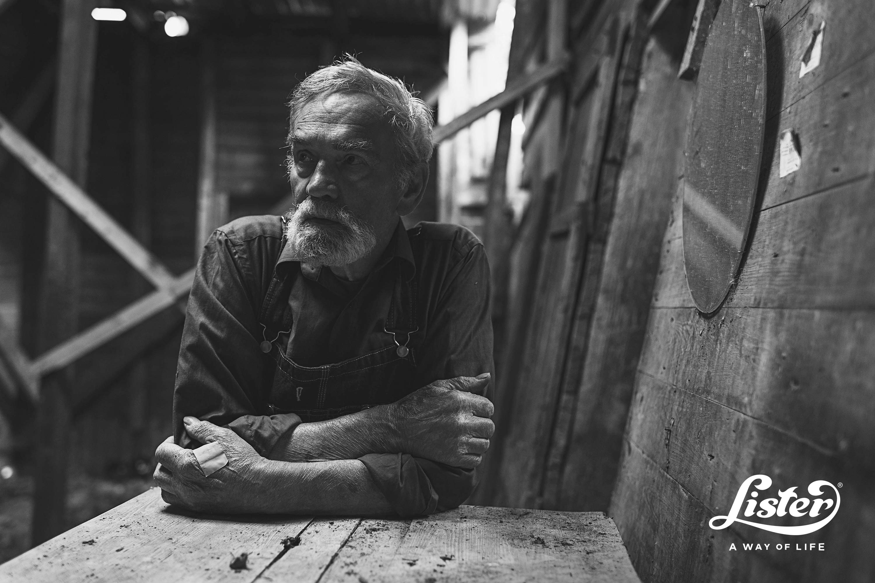
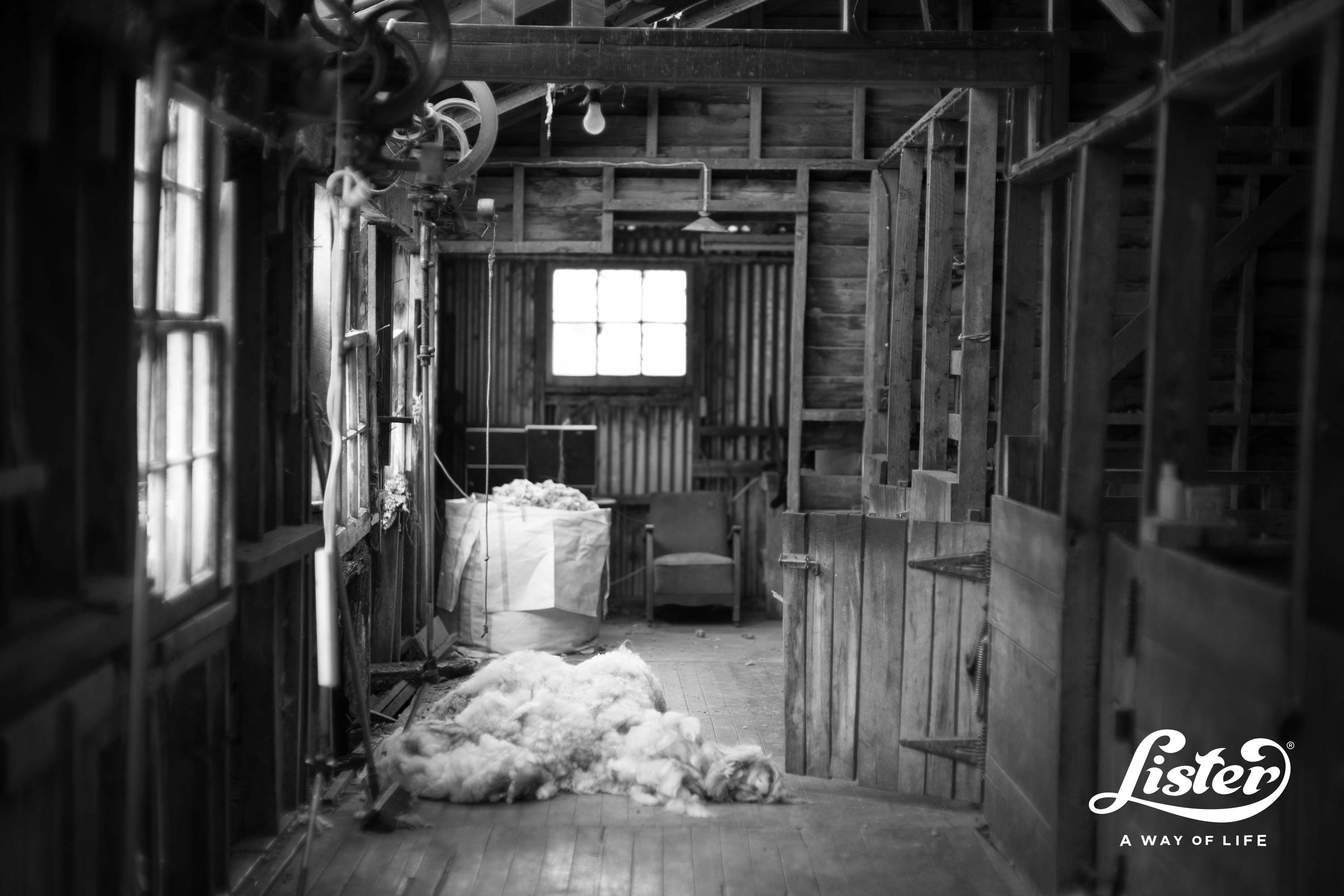
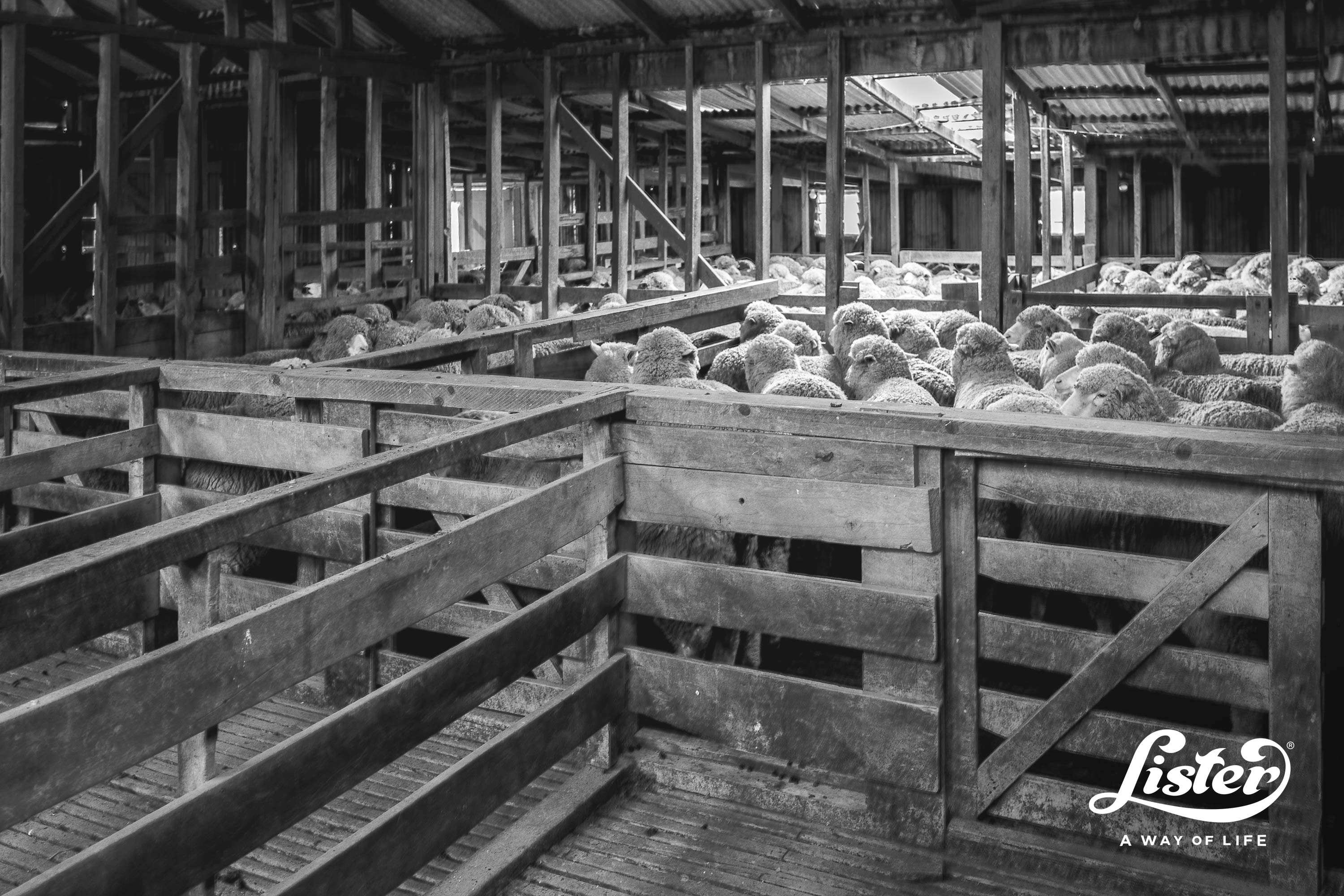
However, there’s more to a brand than just a logo, and Lister wanted a way to encapsulate what the brand meant to all of their customers. We looked at the different territories that Lister sold their products – from the UK to down under – and dove into publications, profiles and photoshoots to understand the lifestyle of a shearer.

What immediately became apparent to us is that a shearer’s world is all encompassing. There’s no 9 to 5, as shearing gangs are constantly on the move. Those gangs are like family, and in a shearer’s actual family, equipment gets passed down from generation to generation. It’s not just an occupation – shearing is a way of life. This became our strapline and quickly became the Lister ethos.
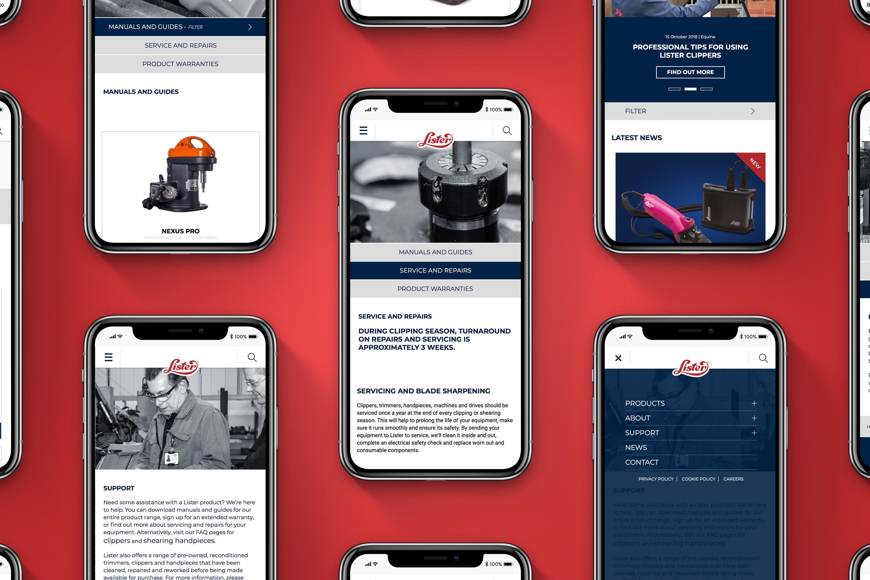
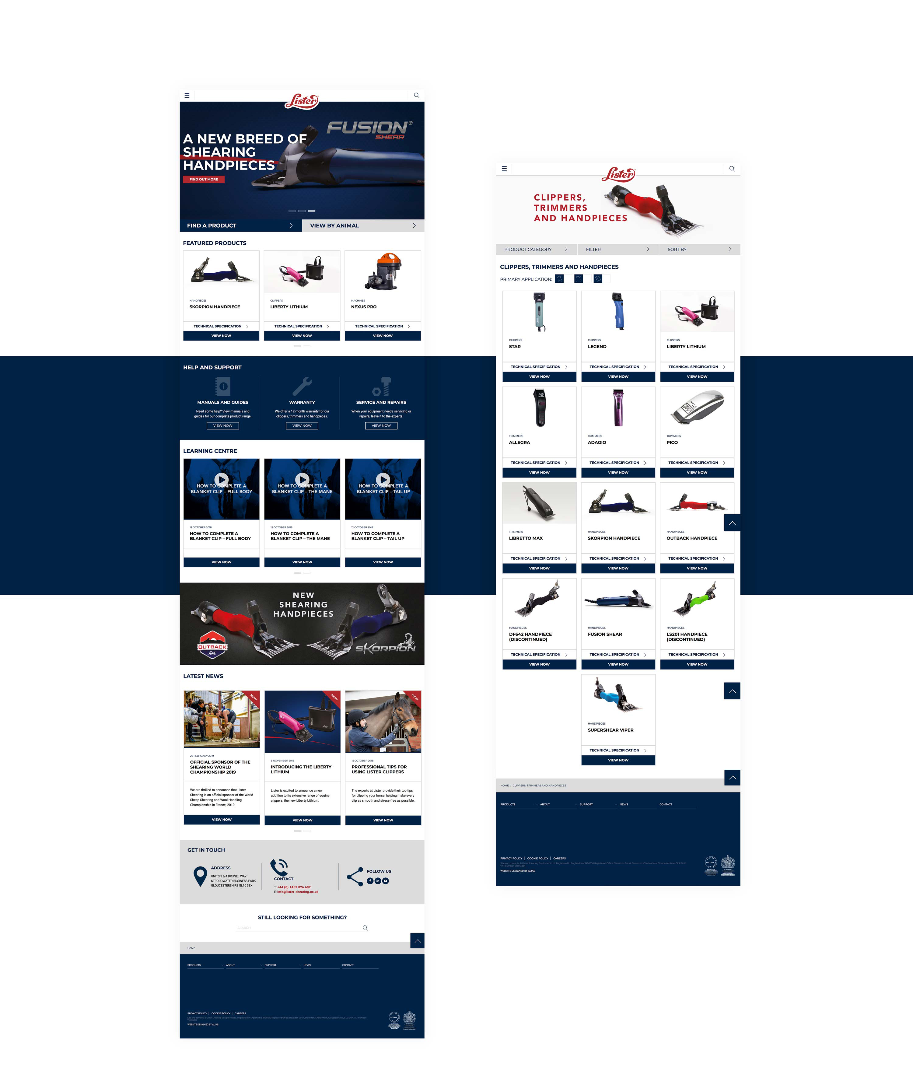
Even in the heart of the outback, a shearer’s life is driven by digital. Shearers stay connected on their phones, so we needed to move Lister on from a plain, inflexible site to a fully responsive website – built from scratch, with a bespoke CMS tailored to their business needs – that would showcase all of their products to a more modern audience. Taking inspiration from the way that tool manufacturers categorise their vast catalogue of products, we developed an easy way for users to find products, no matter what page they’re on, and made it simple for users to filter by animal, with handy icons to show which products were suitable for each type.
An innovative return
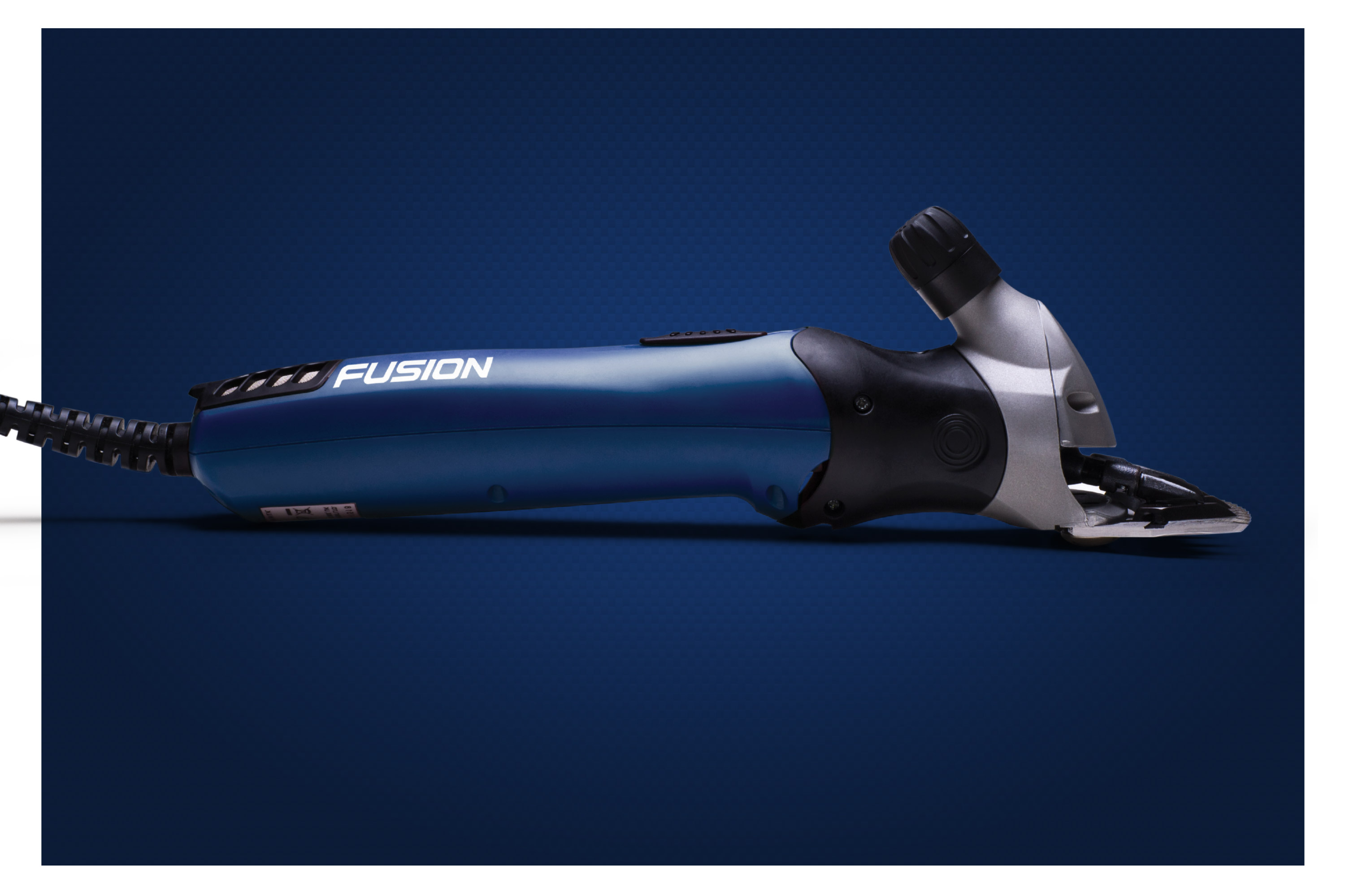
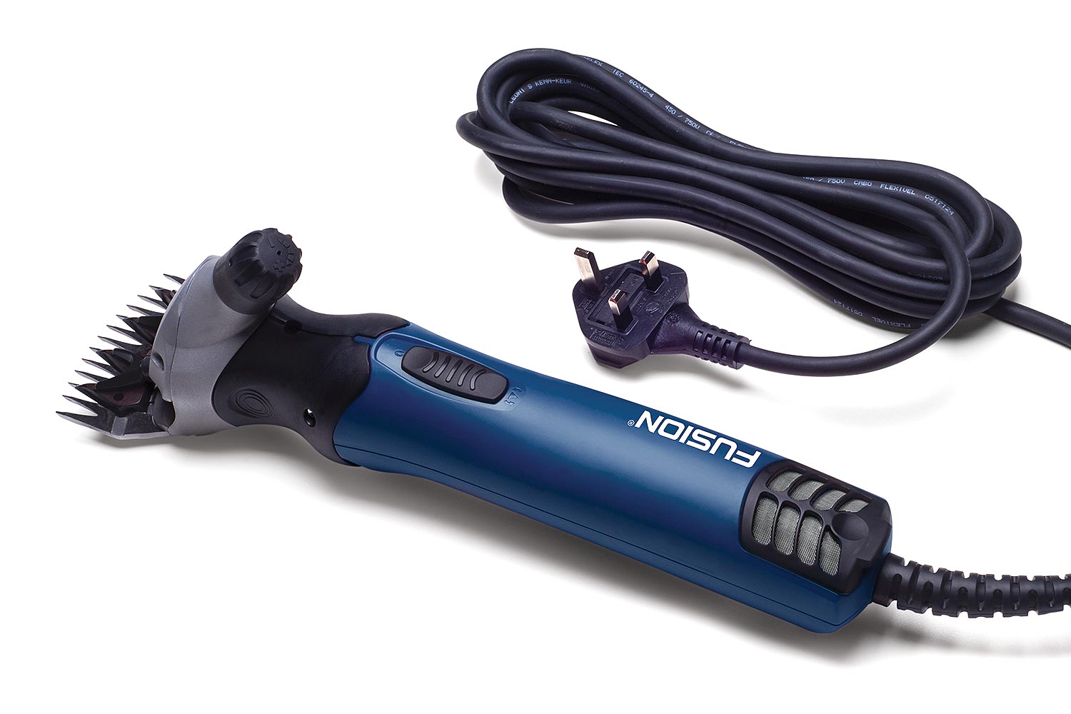
As part of their drive to return to the top of the market, Lister released the Fusion – its first unique handpiece in several years. Meant for both sheep and cattle, rather than a single application like most handpieces, we positioned the Fusion as an engineering breakthrough with sleek product photography and developed a futuristic, custom font to help it stand out on the shelf.
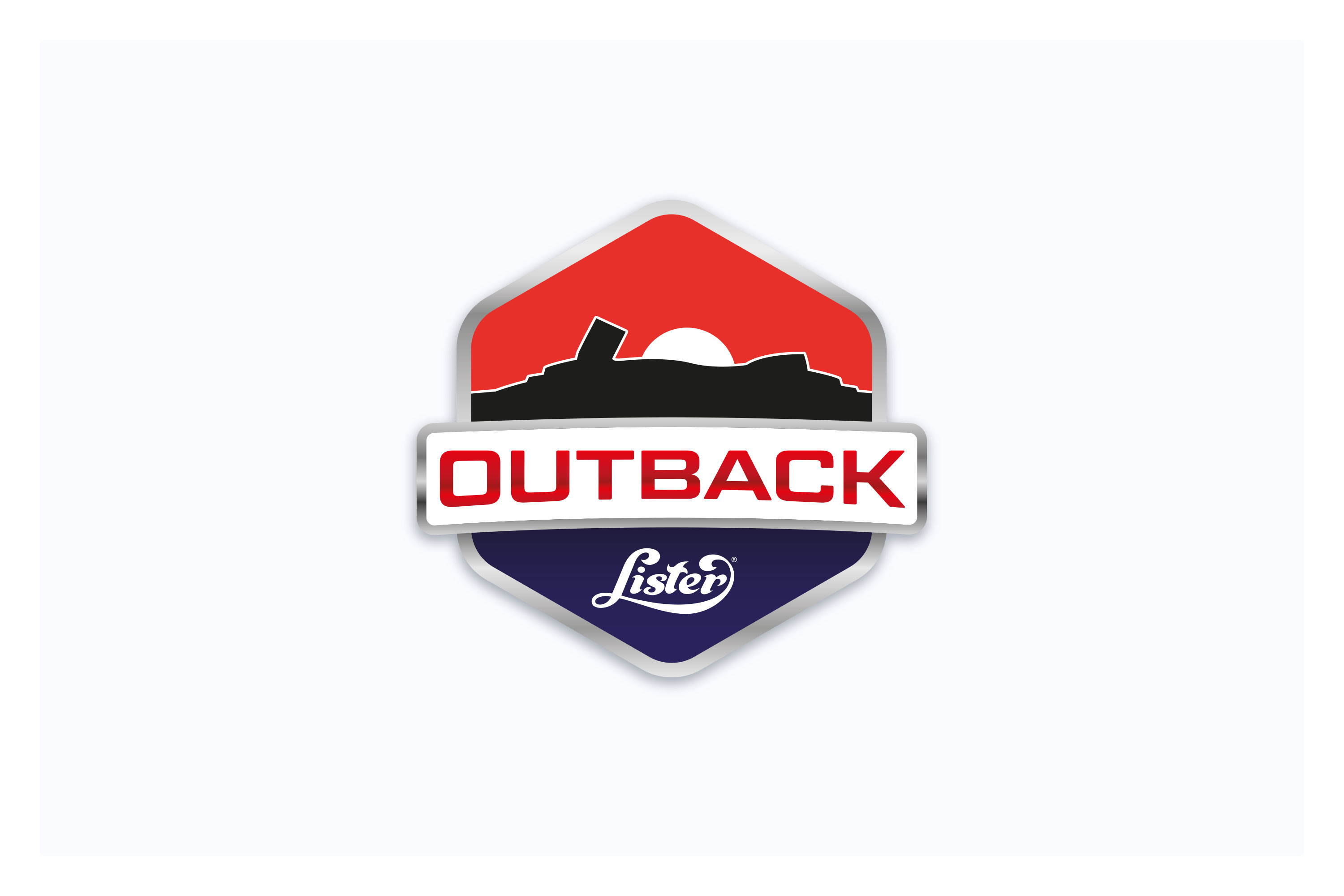
Similarly, for the new Outback handpiece, we drew on shearing's great connection to Australia and New Zealand and noticed that the handpiece itself looked like mountains in the outback itself. We then developed a rugged logo style, inspired by truck badges, and key messaging around the robustness of the handpiece in harsh environments.
Reinvigorating sales worldwide
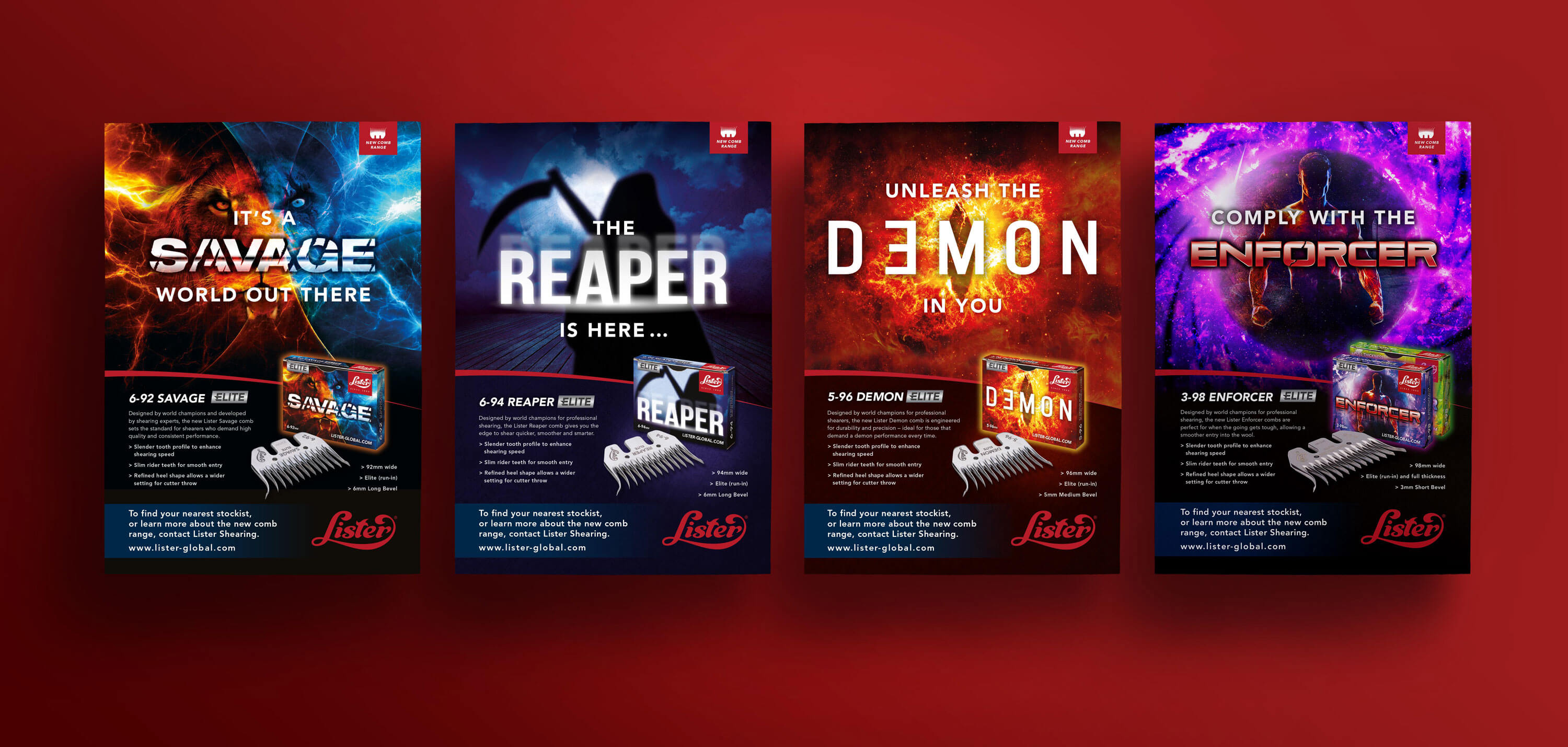
When Lister announced a range of new combs – their first in over five years – they turned to us to develop standout packaging that would help them take on their rivals on the shelves of stockists in Australia and New Zealand.
After competitors began to corner the market, it was key to encourage trust amongst users with a new, untested product, while making sure that the comb boxes would catch the eyes of shearers looking for something different.
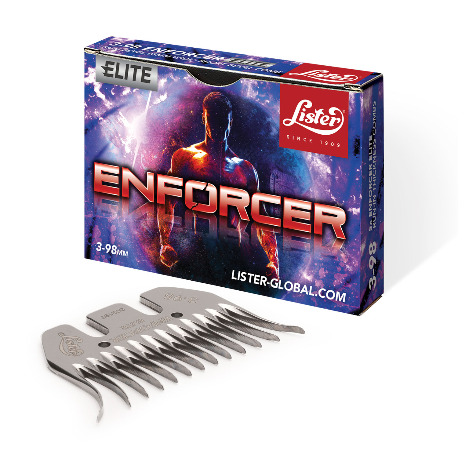
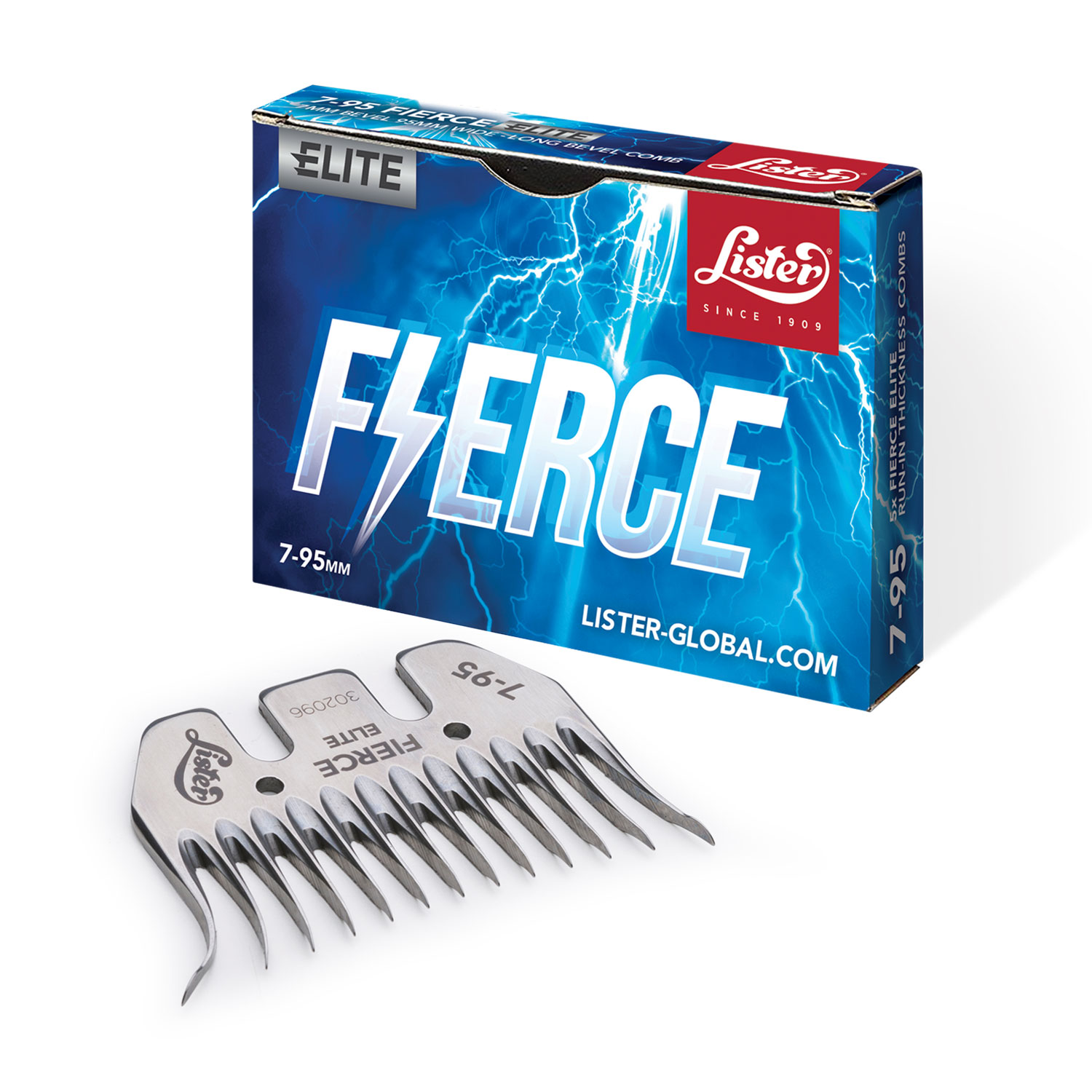
With a list of names that had been selected by Lister’s ambassadors and shearers down under, we got to work. We chose imagery that would evoke the nature of each name, paired with vibrant colours that would give each individual comb its own distinctive look. We also developed a specific typeface for all comb boxes, then modified that typeface to better suit the individual essence of each comb. We also developed an ‘Elite’ categorisation tag for certain combs, making it easy for customers to distinguish between different thicknesses.
Once each concept had been signed off, we then rolled out the design across a variety of marketing collateral, developing copy and artwork for posters and social media graphics, which were then given to network of Lister’s distributors to use in store and online.
The rollout of the combs has been highly successful for Lister – in just six weeks after launch, the company had sold more combs than they had in the entire 12 months prior. Comments from the Lister team mentioned that the marketing had a great part in this, and had ensured that the combs stood out in a competitive market.