Background
Randall & Payne has been an accountancy firm for over 140 years, but in a business world that changes at pace with a focus on tomorrow, a company’s heritage is no longer a marker of its future success. With Making Tax Digital on the horizon, and an increase in the use of fintech products by its rivals, we were called in to help reposition the business to ensure its relevancy in an increasingly digitally led sector.
Thinking to capitalise on
When defining any brand proposition, ensuring the senior team are all on the same journey is crucial to the success of any change. Our first step was to benchmark the individual thinking of the senior leadership team via our fact-find process, understanding how they seen their business today, where they see it tomorrow and where their thinking differs from their colleagues.
These insights not only allowed us to build a bespoke workshop to pull together the different strands of thinking and to debate and build on what we were told, but also to challenge and redefine the brief, moving the thinking of the business from evolution to revolution.
Throughout the discovery process, an unwritten ethos and way of working was often referred to by the senior team. Based on the cleverness of their people and the value their expertise brought to clients, no one had ever been able to verbalise or capture it in a way that could enhance the brand.
We saw this as a great foundation on which to present the new look of the business, creating the brand platform ‘Thinking to capitalise on’ – a bold promise that meant whether the client was looking to save money or make money, the expertise and advice of the team would always help them prosper. Not only was the brand platform designed to help crystallise their approach to external audiences, it also formed a basis for internal clarity amongst the organisation.
Bold promise, bold identity
While the original brief was around evolving the brand currently in place, it was clear there was an appetite to be brave. While there was an opportunity to create something totally new, we also wanted to produce something that built on what had been there in the past.
We created a combination marque-style identity. For the wordmark element, lowercase lettering was used, allowing the firm to be instantly seen as modern, approachable and friendly. We resisted changing the ampersand in the name to a more modern representation such as a plus sign to keep some heritage in the brand, and instead took the opportunity to modernise it.
An abstract version of a bar chart was used to frame the wording elements, giving a strong visual division between the company name and the strapline. Finally, we moved the company away from its current brand colours of dark green and purple to a single colour – a bold shade of purple to match its bold client promise.
A consistent language
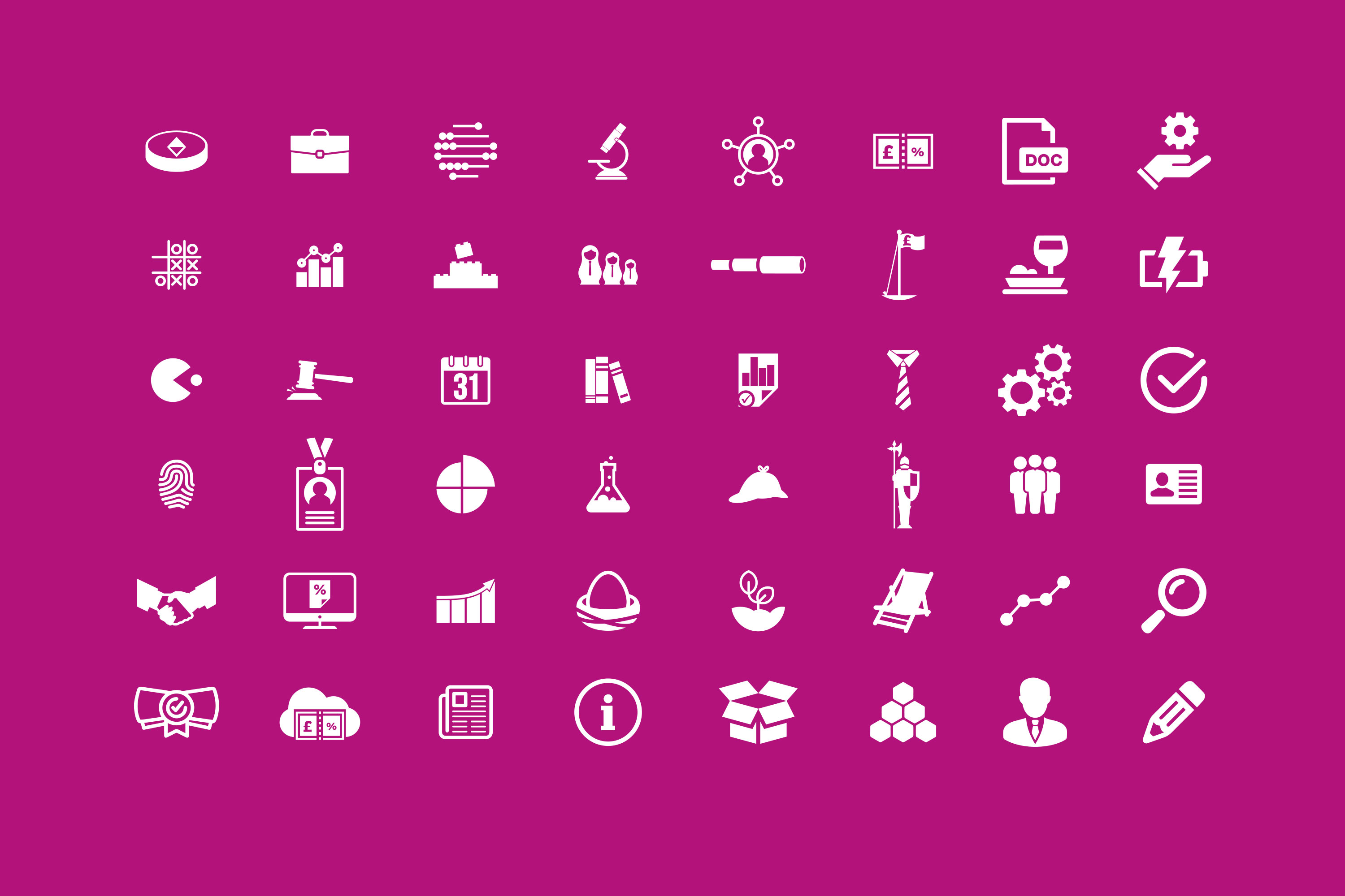
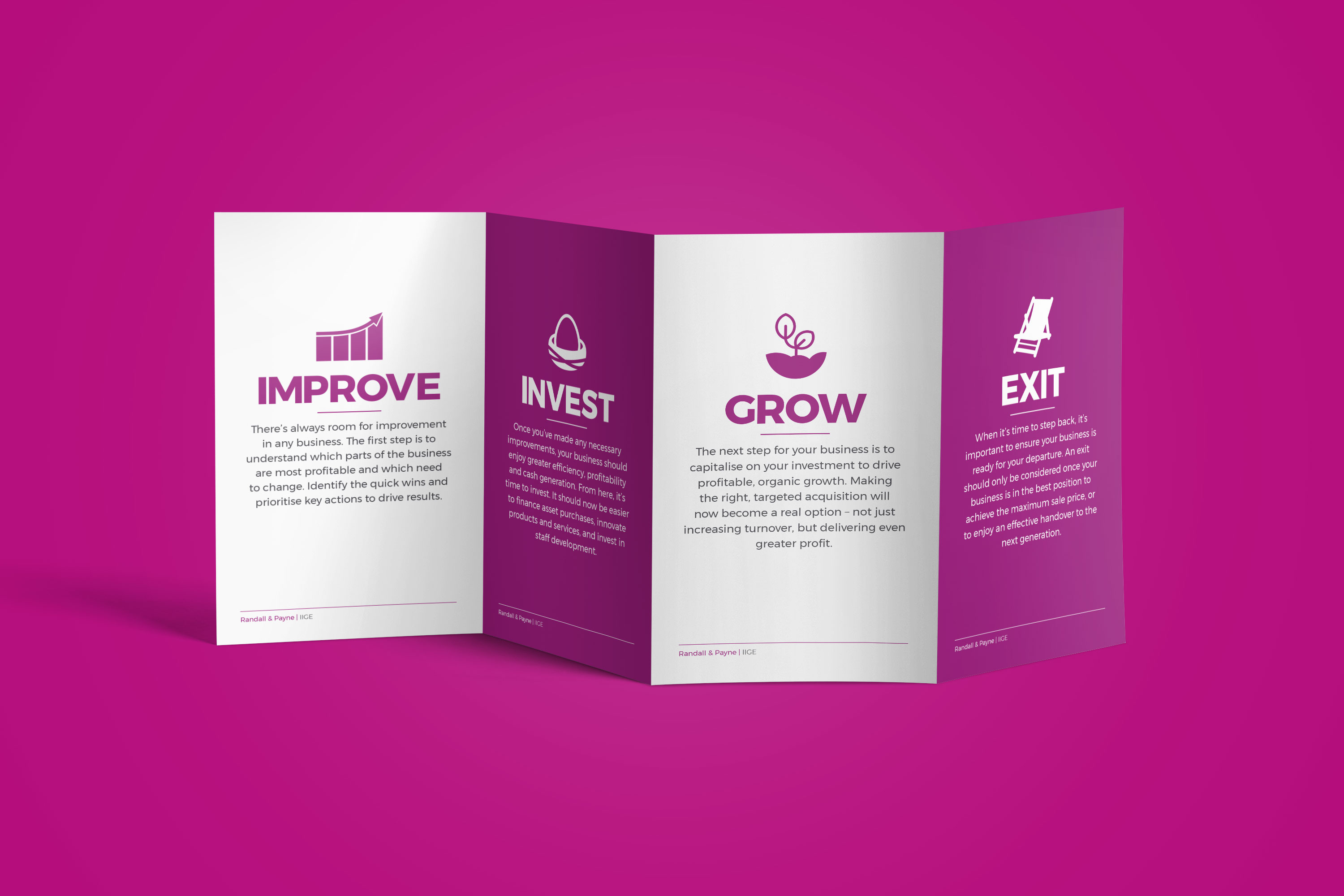
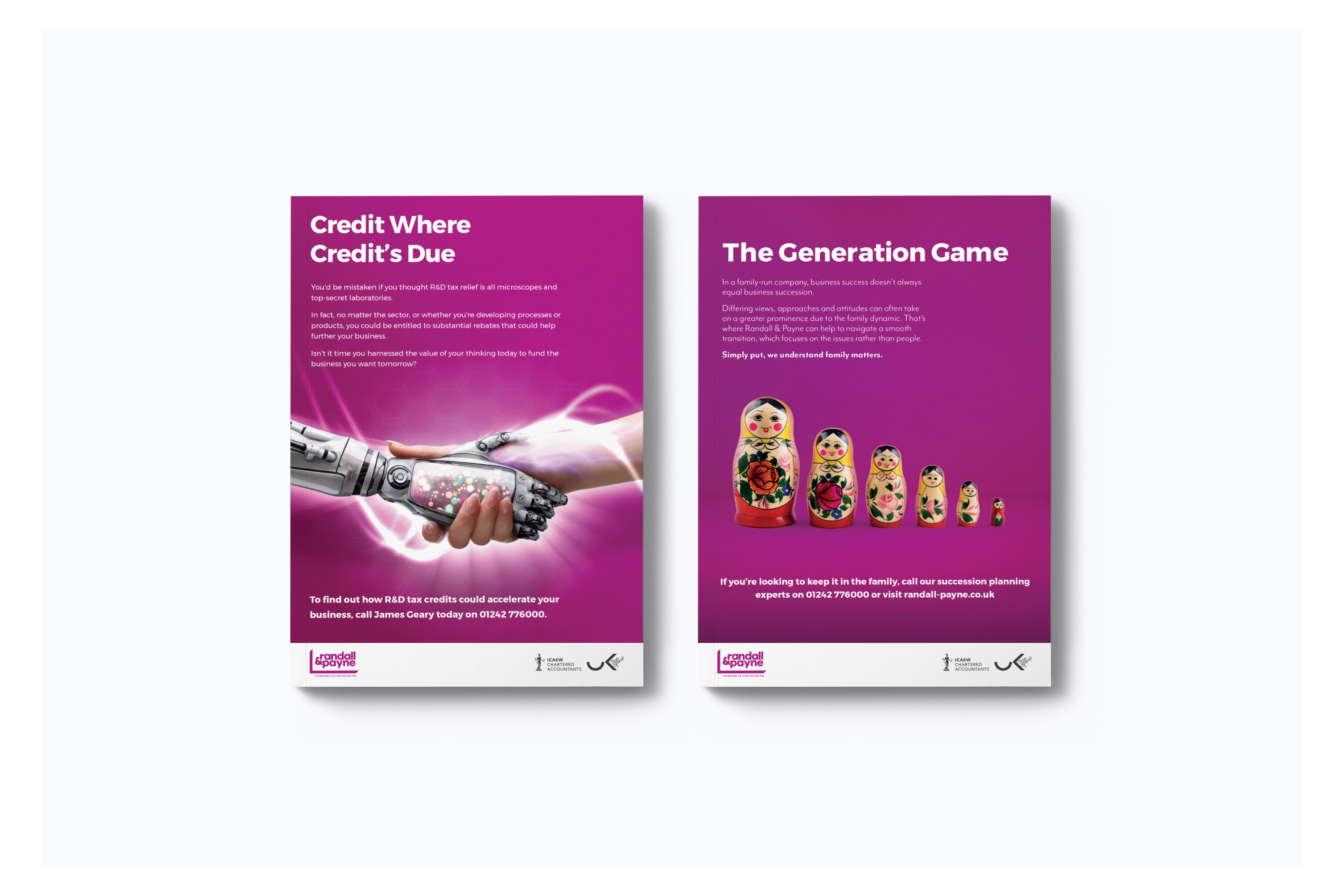
Once the identity and brand platform was agreed, we devised a distinctive visual language that would ensure consistency and clarity for the brand. We created bespoke, playful iconography that would help the company be seen as contemporary across both print and digital materials. For example, Pac-Man was used to illustrate business acquisition, while Russian dolls were introduced to represent support for family businesses.
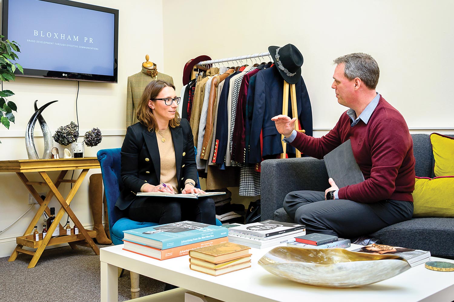
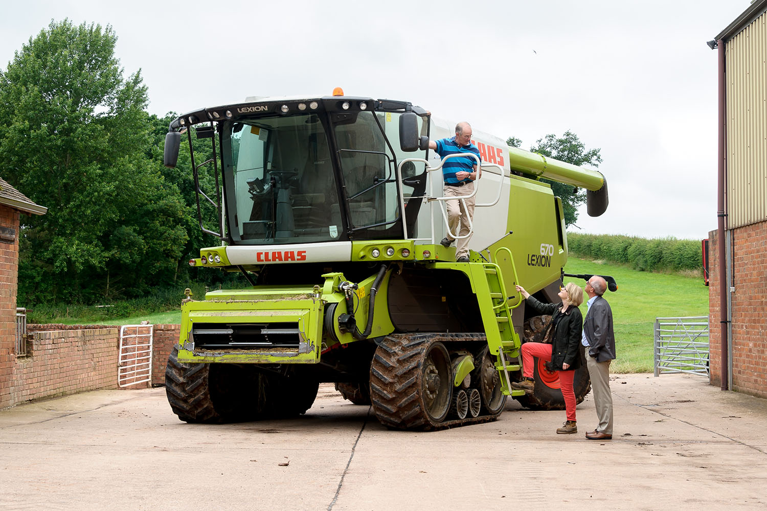
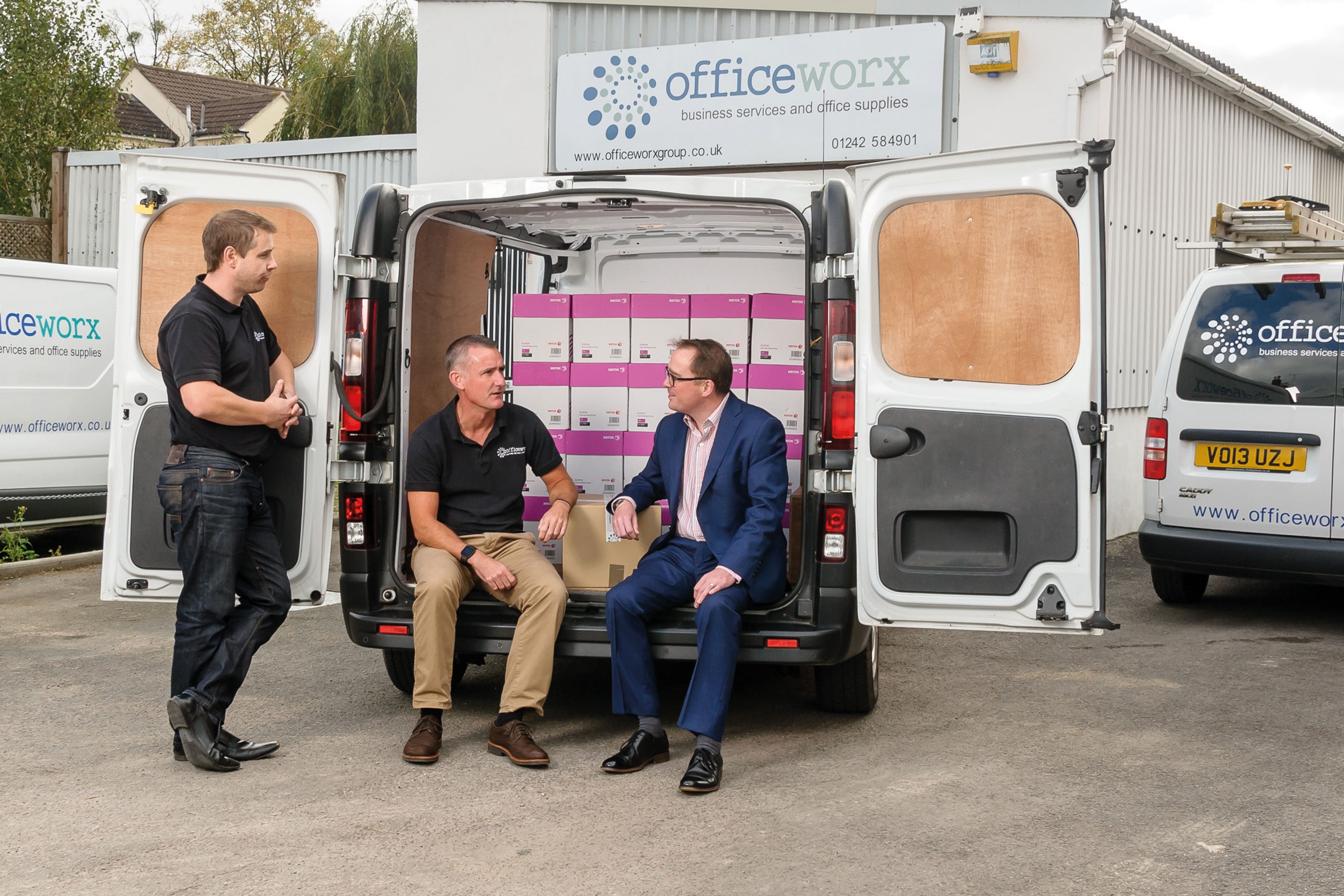
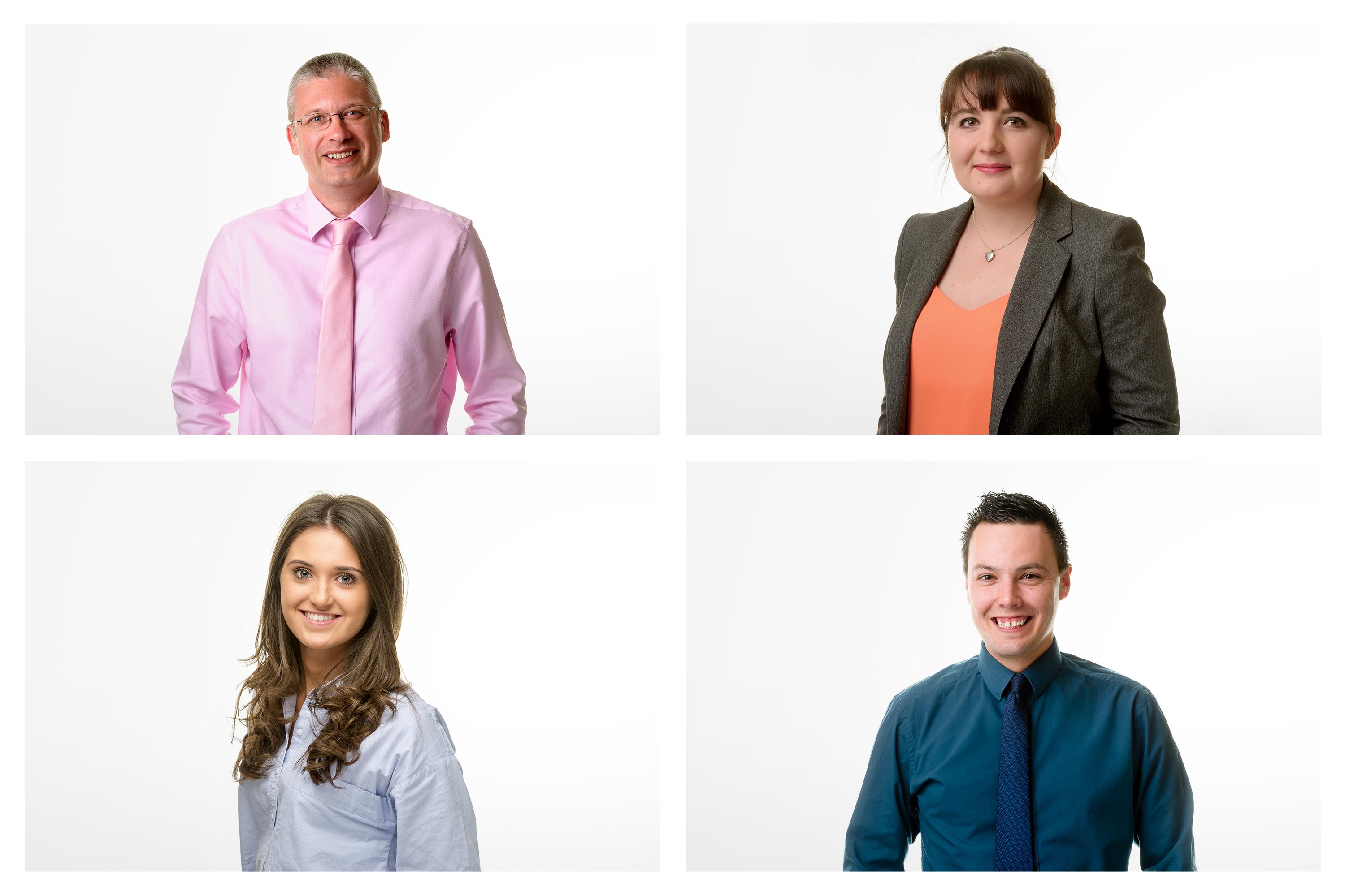
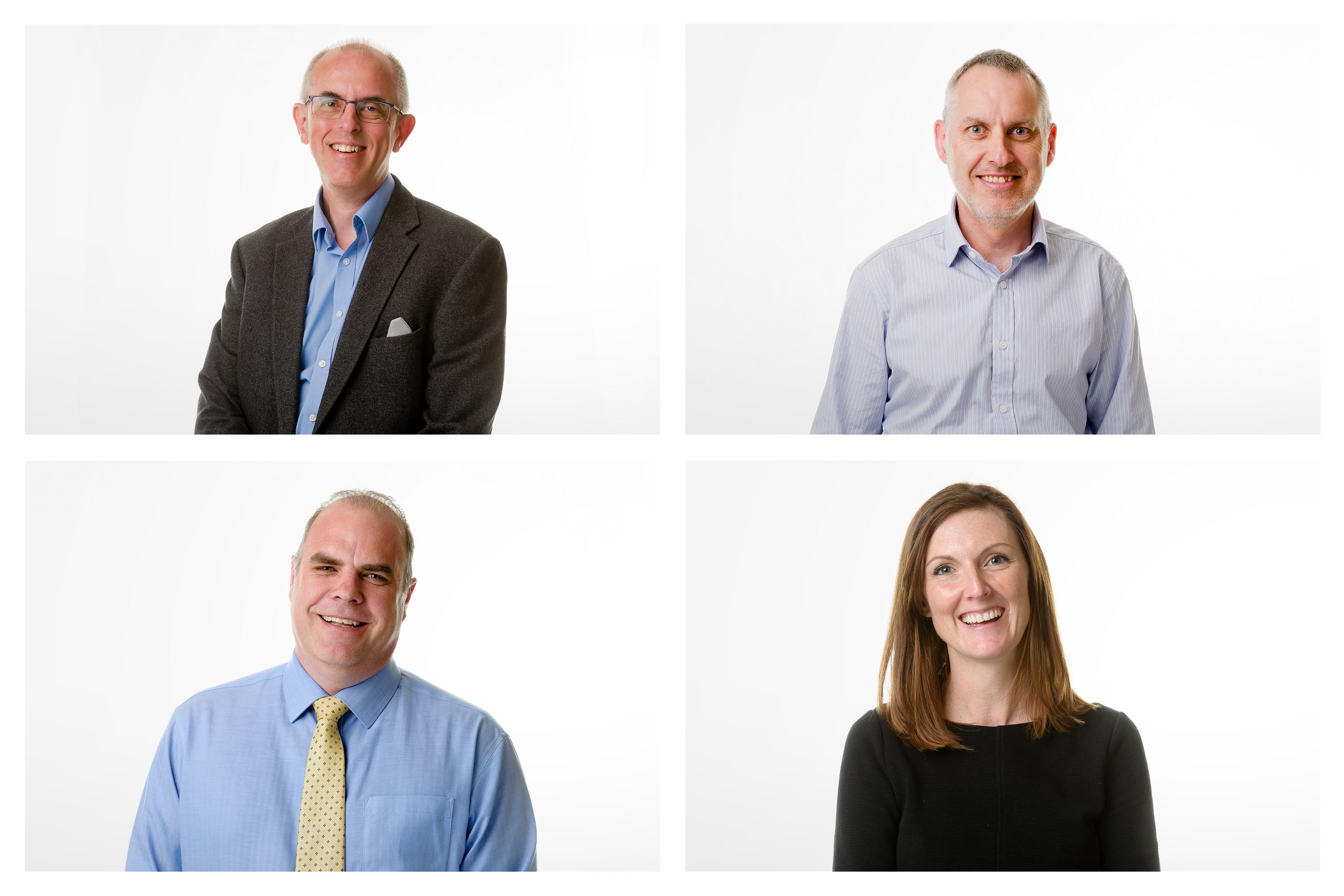
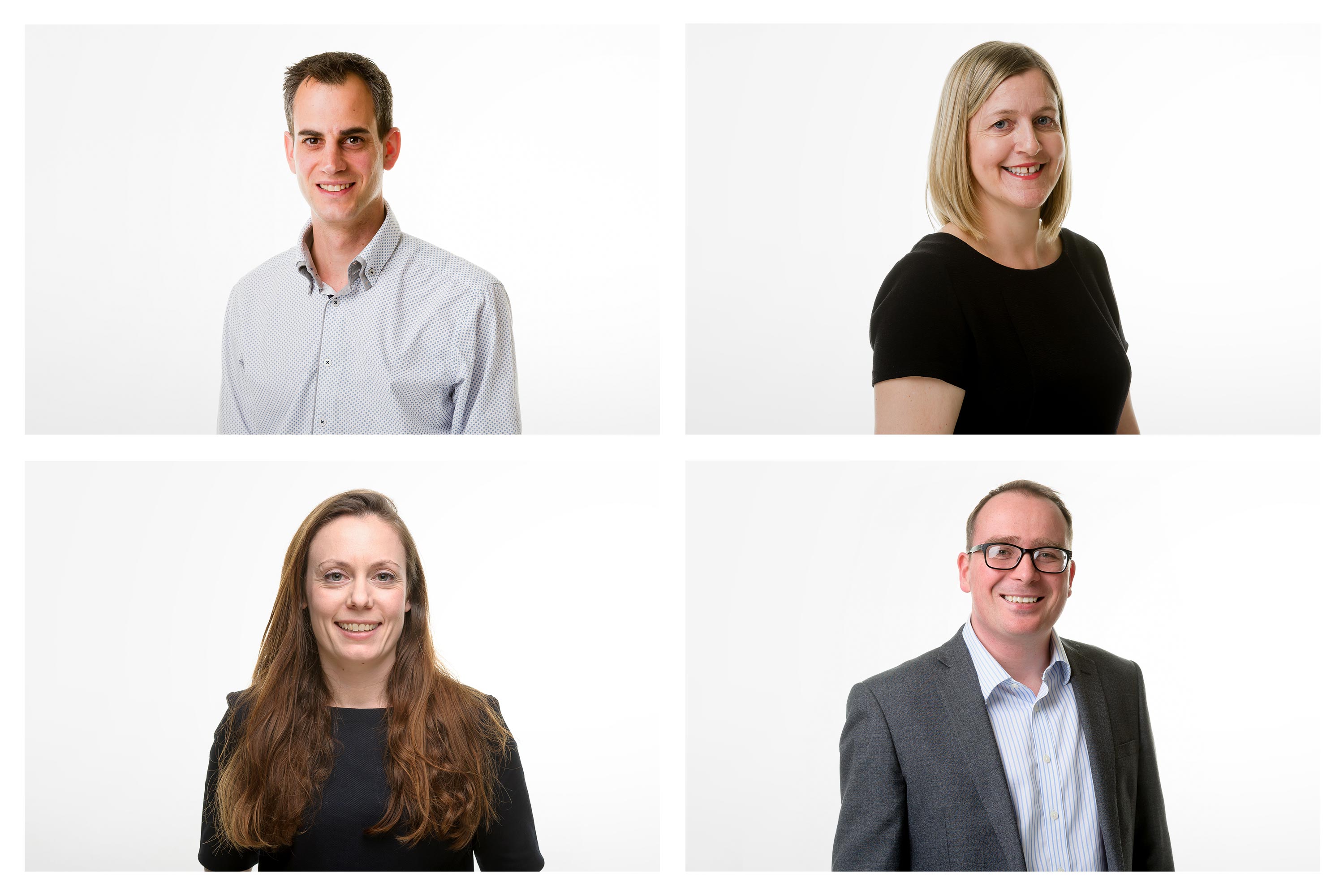
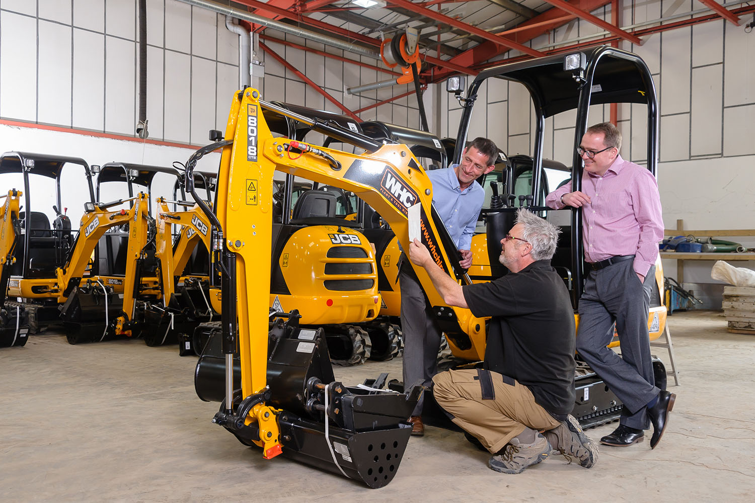
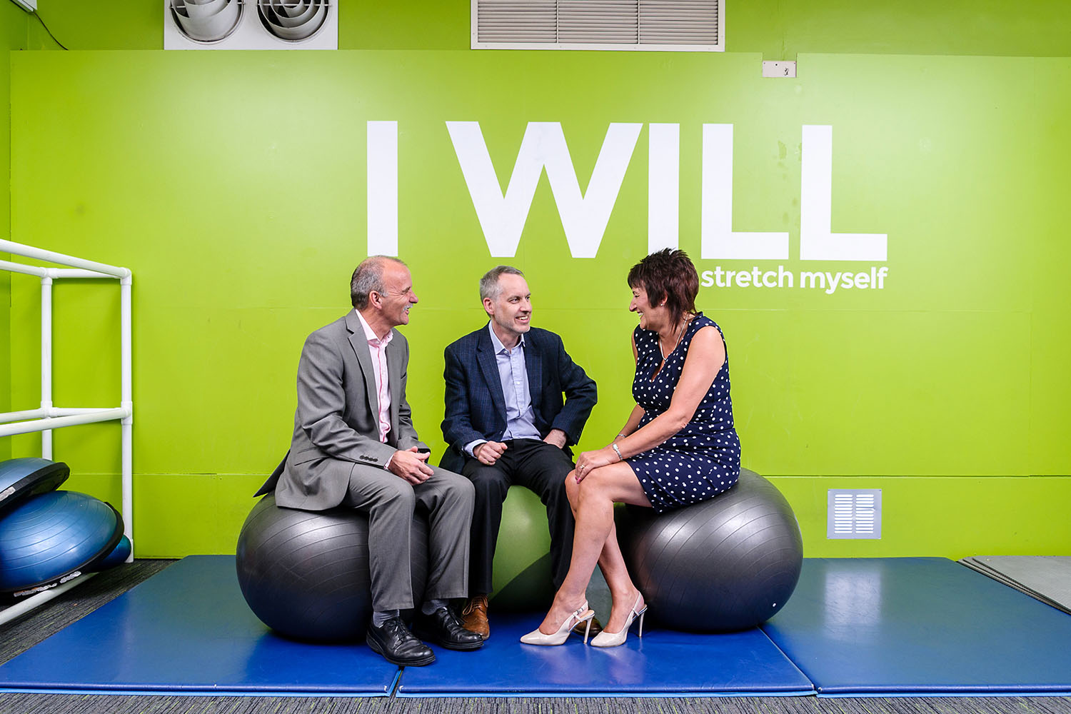
Strong, bespoke imagery was also taken. Dynamic headshots of Randall & Payne’s 57-strong team were commissioned to capture the essence of the team, while the senior team were followed as they went on location to meet clients, from the middle of a cornfield in Herefordshire to poolside at a leading leisure facility.
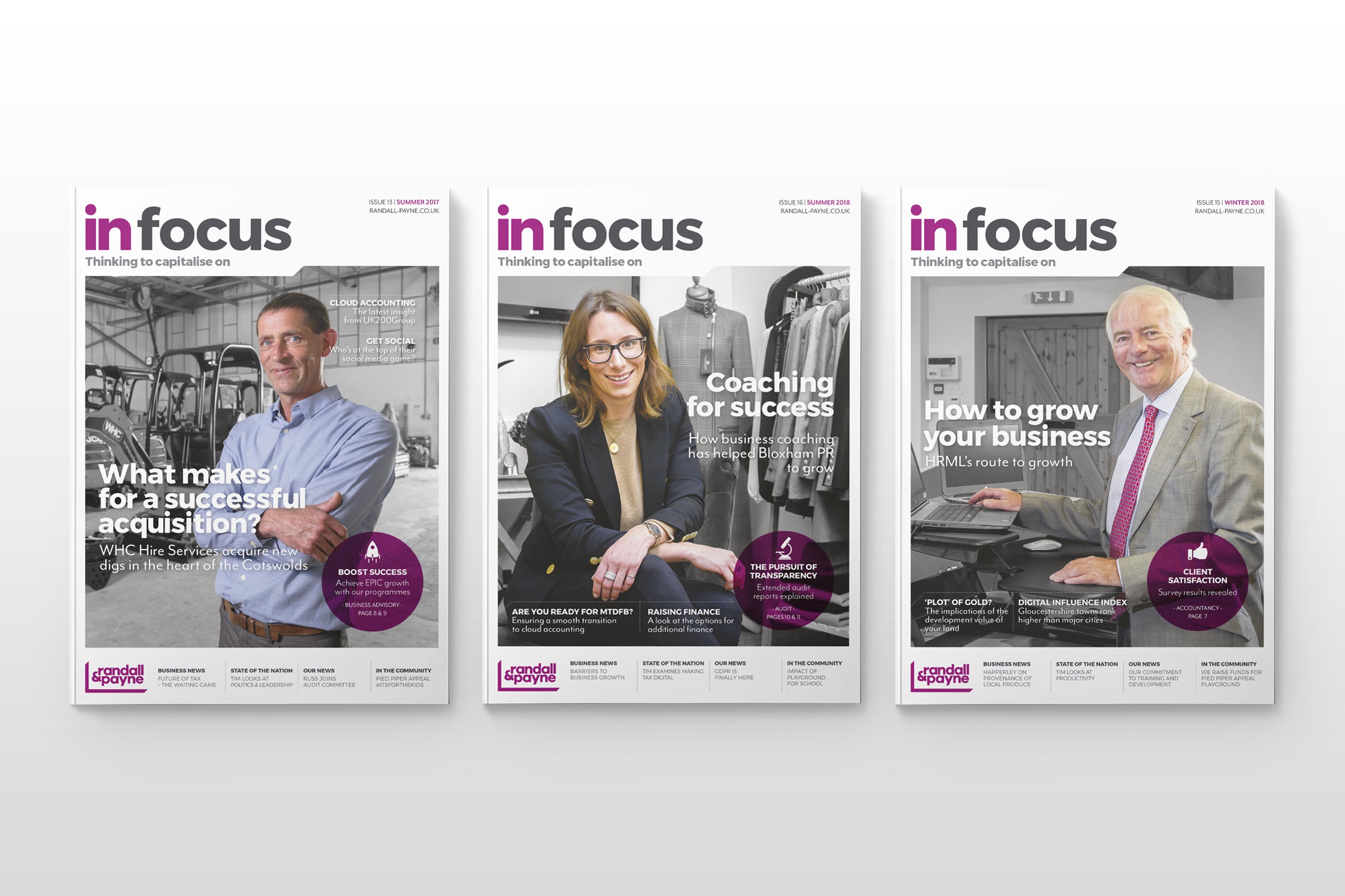
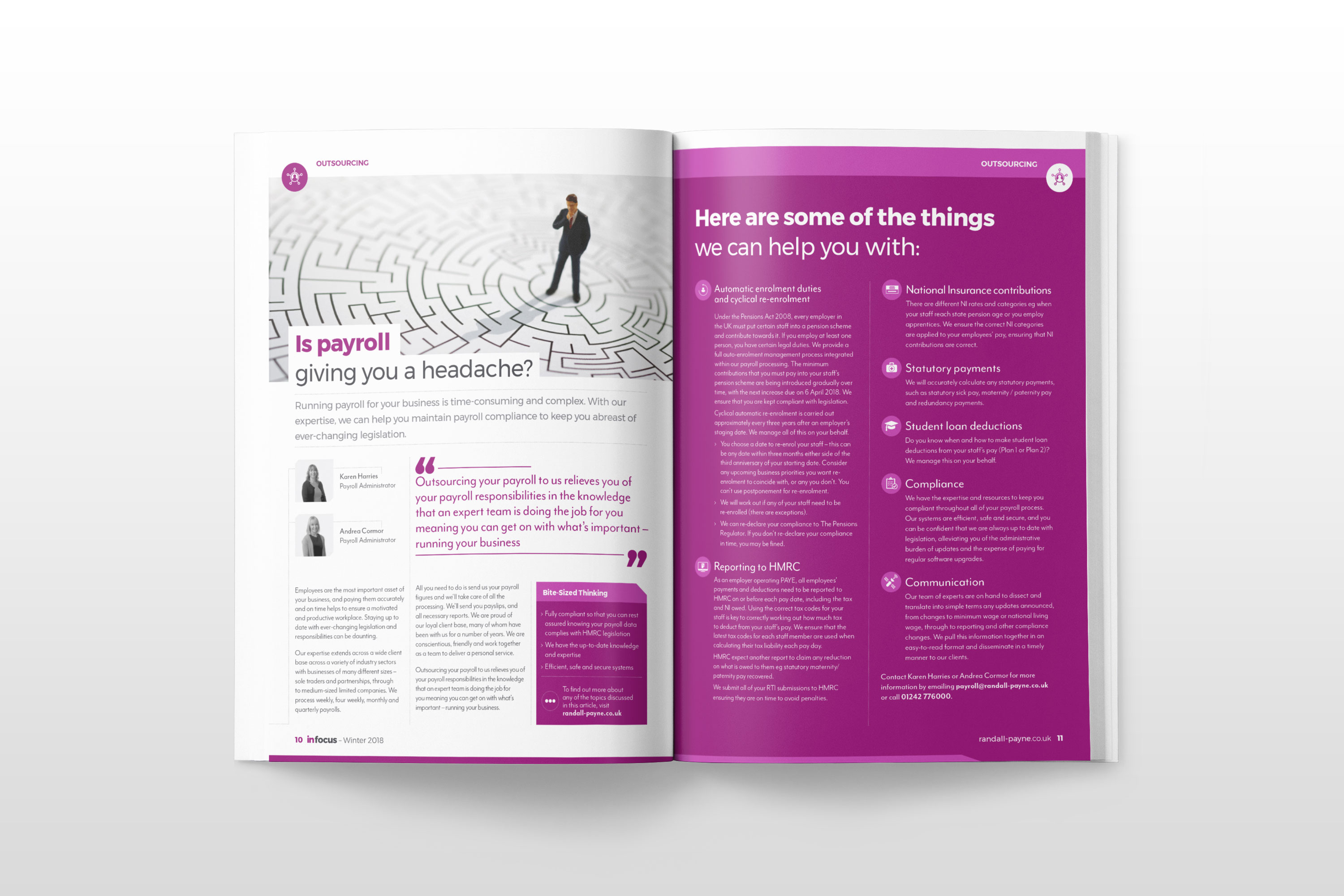
A suite of fresh collateral that reflected the company’s new positioning was also created, including an overhaul to their quarterly business magazine In Focus, as well as signage and brochures.
A digital shop window
Randall & Payne’s old website was uninspiring and tricky to navigate. In fact, it was so often hard to find the information needed, the internal team would use Google to explore their own site. So, we flipped all of that on its head by designing and building a bespoke, responsive website.
Given we constructed the brand promise around the guile of Randall & Payne’s people, we made sure that the partners and staff were front-and-centre throughout the site. The images and iconography created as part of the visual language were used throughout and a modern and confident tone of voice was also developed.
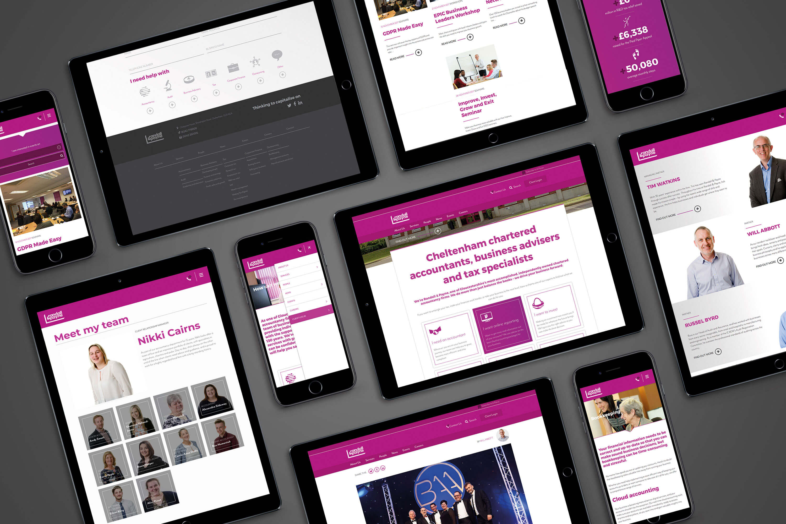
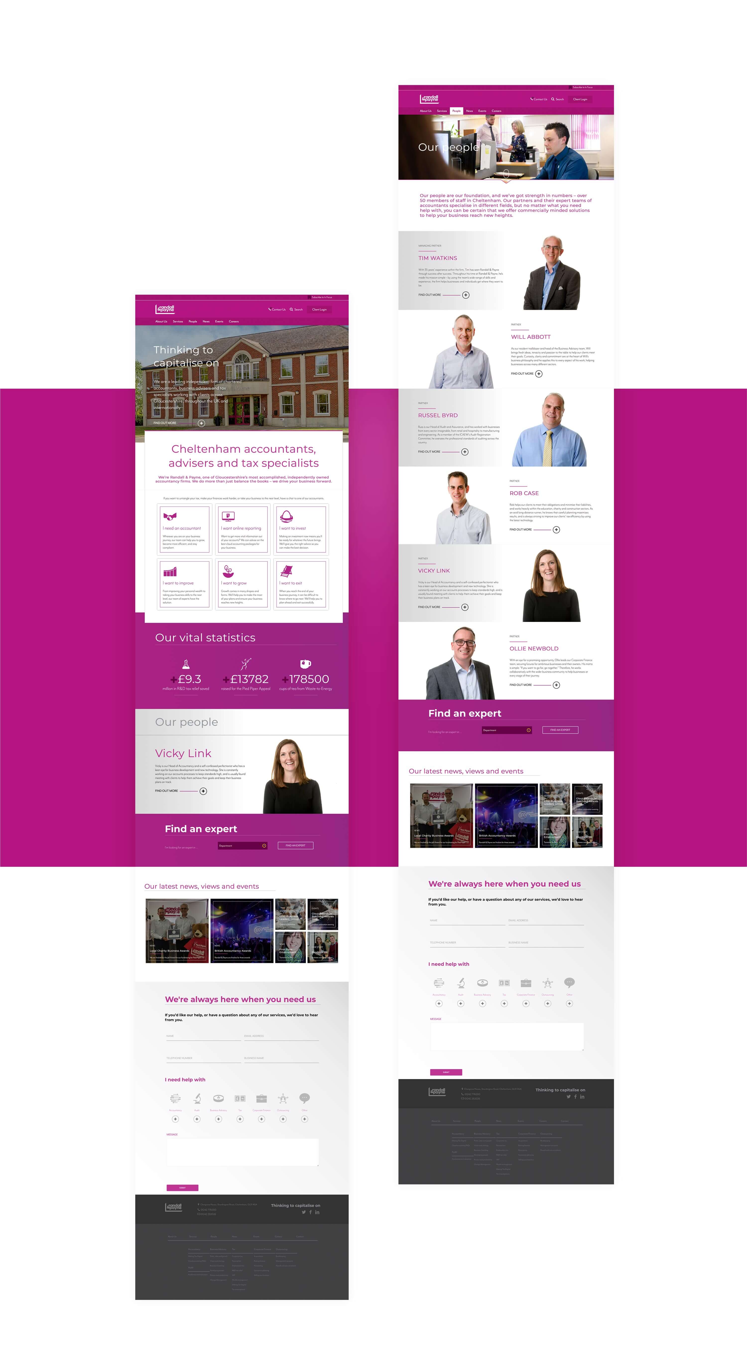
A bespoke Content Management System gave the internal marketing team full site control, allowing them to update the site with ease when they needed. We also made sure that we could add relevant content at key points of the site, either as case studies or as related articles, to keep people browsing for as long as possible.
Before launching to the brand positioning to external audiences, we held a briefing for the company’s staff to take them through the essence of the brand and what it meant for them. We then supported the external launch in the local press and a customer outreach programme.