Background
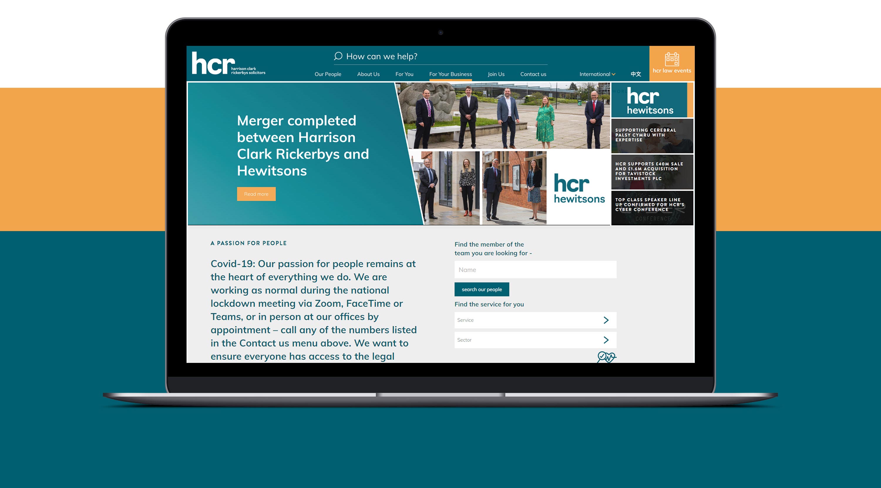
Leading law firm Harrison Clark Rickerbys (HCR) are fast becoming a recognisable high street presence, with a growing number of offices across the country. Throughout their expansion in recent years, the firm have been looking to make their substantial offering more accessible and position themselves as the people to turn to, whether you’re looking for commercial or personal advice.
Turning expertise into passion
Today, HCR’s strapline is ‘A Passion for People’, but when they turned to Mighty for help, the way they presented themselves through their tone of voice and written collateral said anything but that. Users looking for more information on their website had to wade through reams of legal jargon and copy, with no clear explanation of how their expert team could help.
The HCR marketing team were in the process of putting a new website in place, and approached Mighty to help redefine the brand’s tone of voice to be more accessible and straight-forward. But, with the word count on the website standing at 160,000 words, it wasn’t a small job.
We started by developing a content matrix that encompassed each type of page on the website – from people profiles to key information about their services – and worked with the internal team to understand what was no longer relevant, what needed to change and what needed to be created or added.
From there, we put together a list of questions to ensure uniformity across sections and encouraged the HCR staff to think differently about their role in the business by giving them the opportunity to tell us who they are and what they do. After an initial information gathering phase, which got everyone from paralegals to senior partners involved, we set about drafting the copy for the entire website.
We created a confident yet approachable tone of voice, including a list of words that were to be excluded from their corporate vocabulary moving forward and a set of key phrases and messages that matched the dynamic approach the HCR team have.
Both the tone of voice and content created for each service section became the basis of future content for the firm, with the internal copywriter saying our work had given her “a new lease of life.”
Once the new website launched with our copy, the HCR team received, on average, six times as many enquiries a month as they had done previously, with the new tone of voice resonating with all manner of potential clients.
Changing perceptions
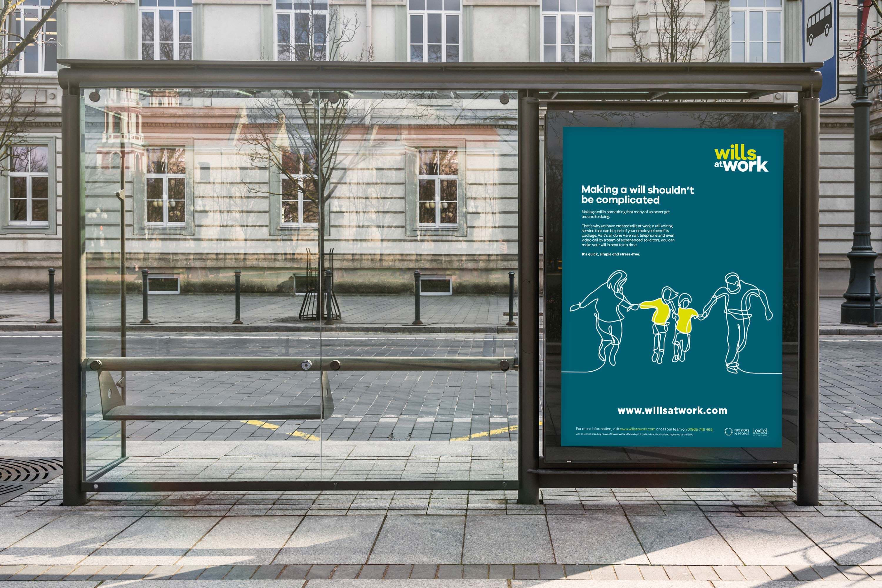
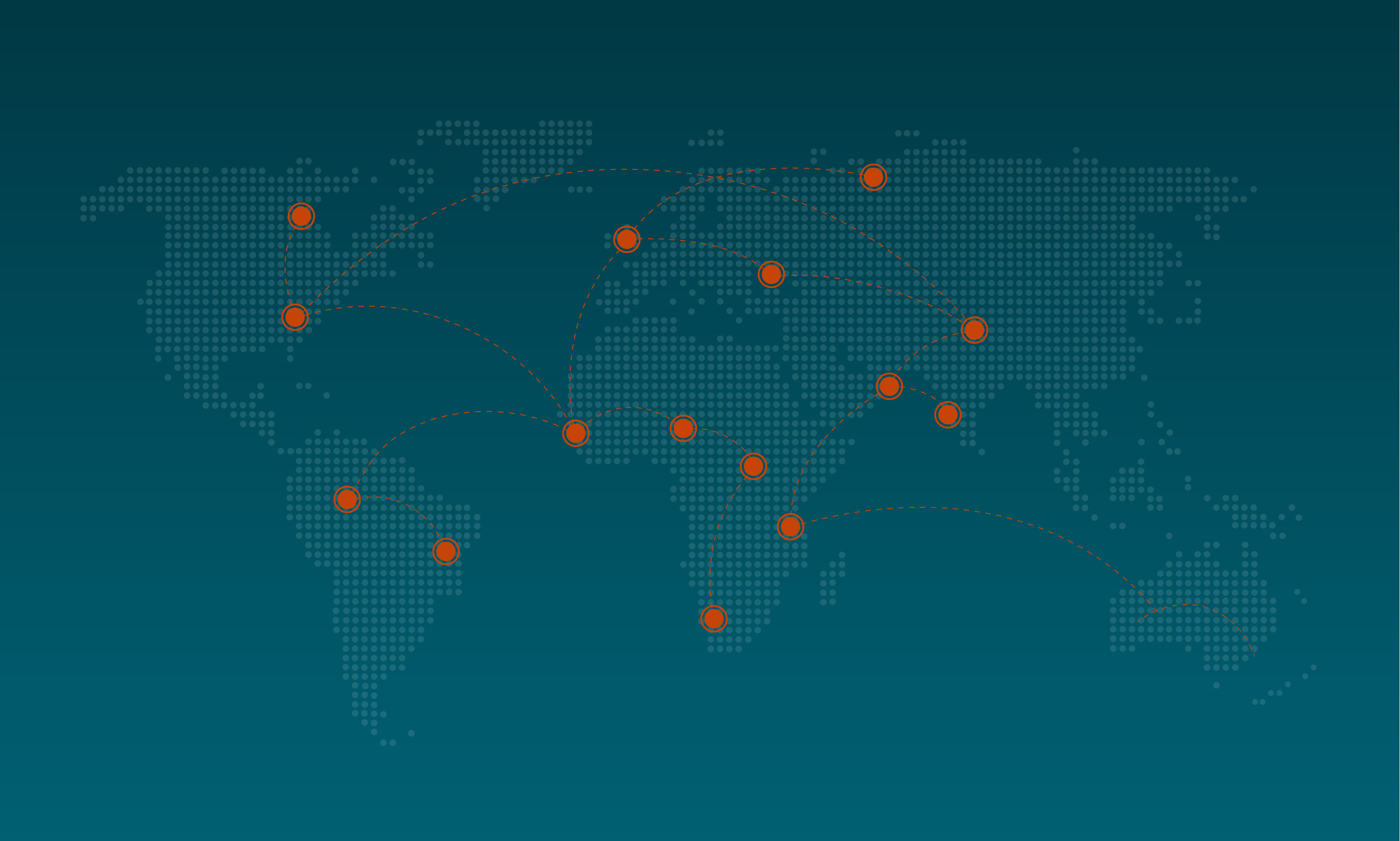
One of HCR’s most successful products is its Wills at Work service – a virtual will writing service that companies can offer staff as part of their benefits package. The firm approached us to develop a standout positioning for the service that would capture the attention of FTSE 100 businesses and their employees.
Our experience of the funeral sector shows that no one likes talking about death, so if we were to succeed, we would have to create a brand that not only came across as fresh and friendly to the employee, but also trustworthy and professional to the HR department.
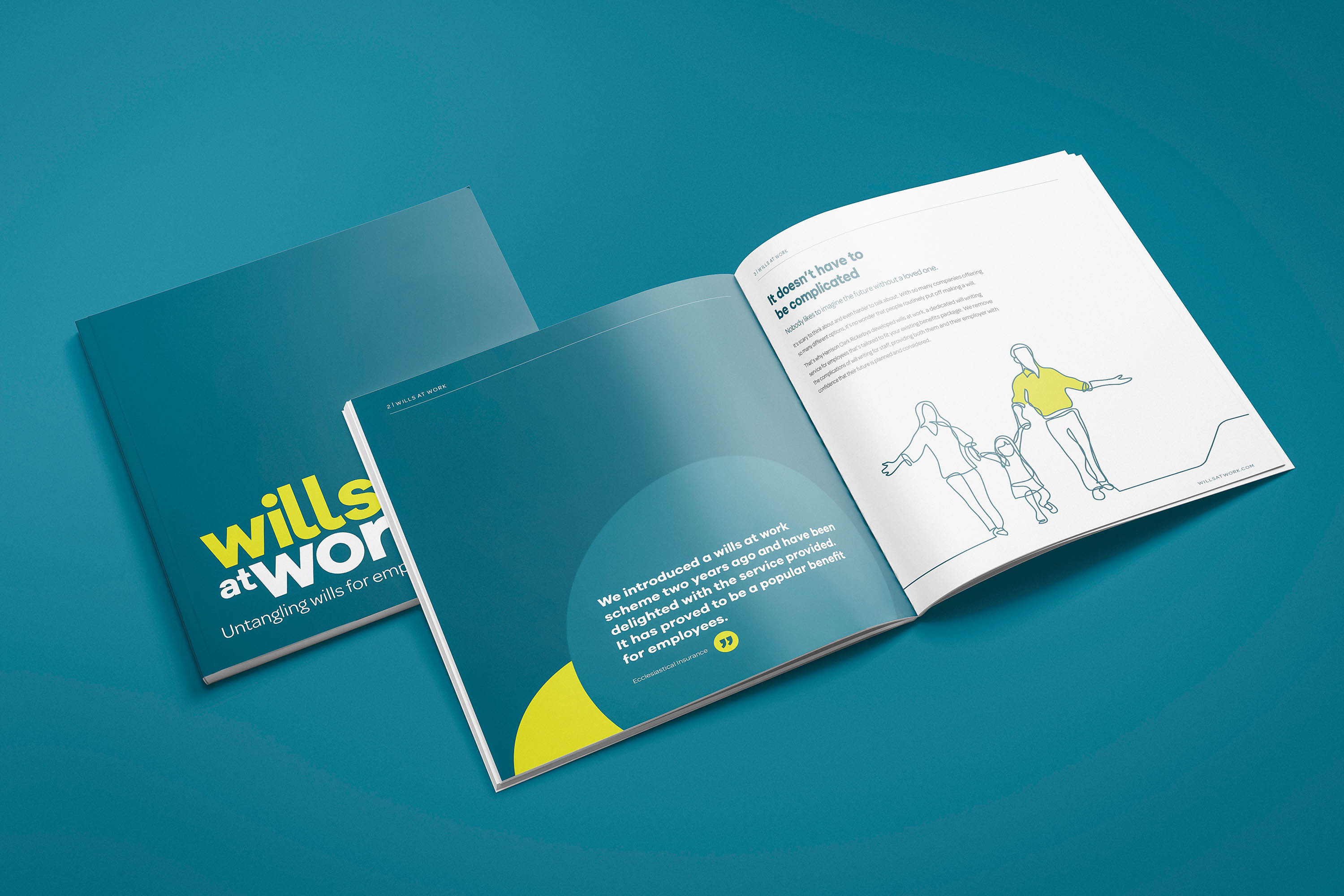
Much like with HCR’s website, we wanted the brand to be friendly and approachable, so we developed a wordmark logo in a lowercase, sans-serif font. We also designed with the future in mind, creating a logo structure that could be easily adapted as the company developed further sub brands.
While it was a new brand, it was important that we forged a connection with the HCR parent brand, and we did this through the colour palette. HCR's teal is a very strong colour, so we were faced with the decision to either use it sparingly or embrace it. We chose the latter, and contrasted it with a mustard yellow that gave us a striking and distinctive colour scheme.
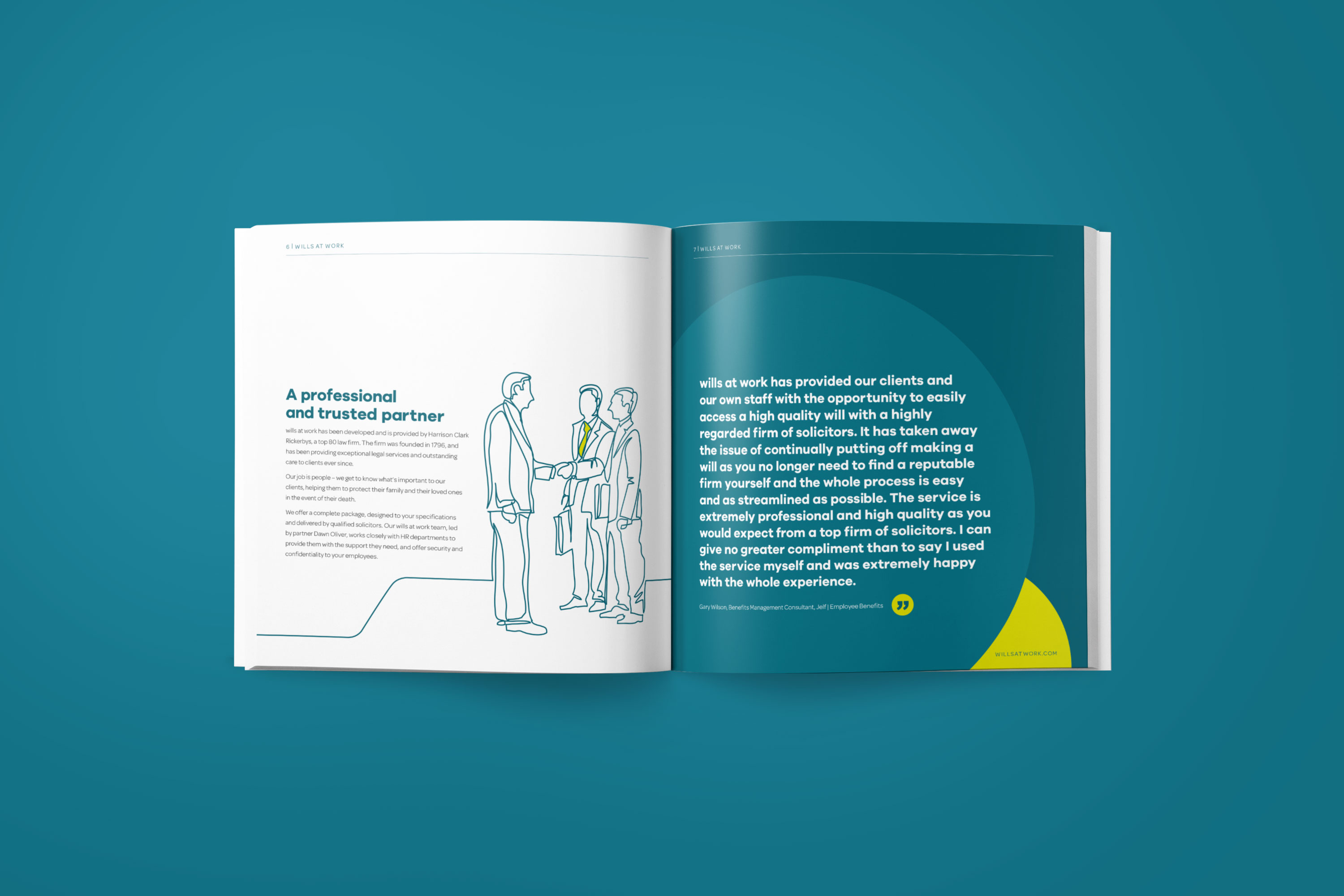
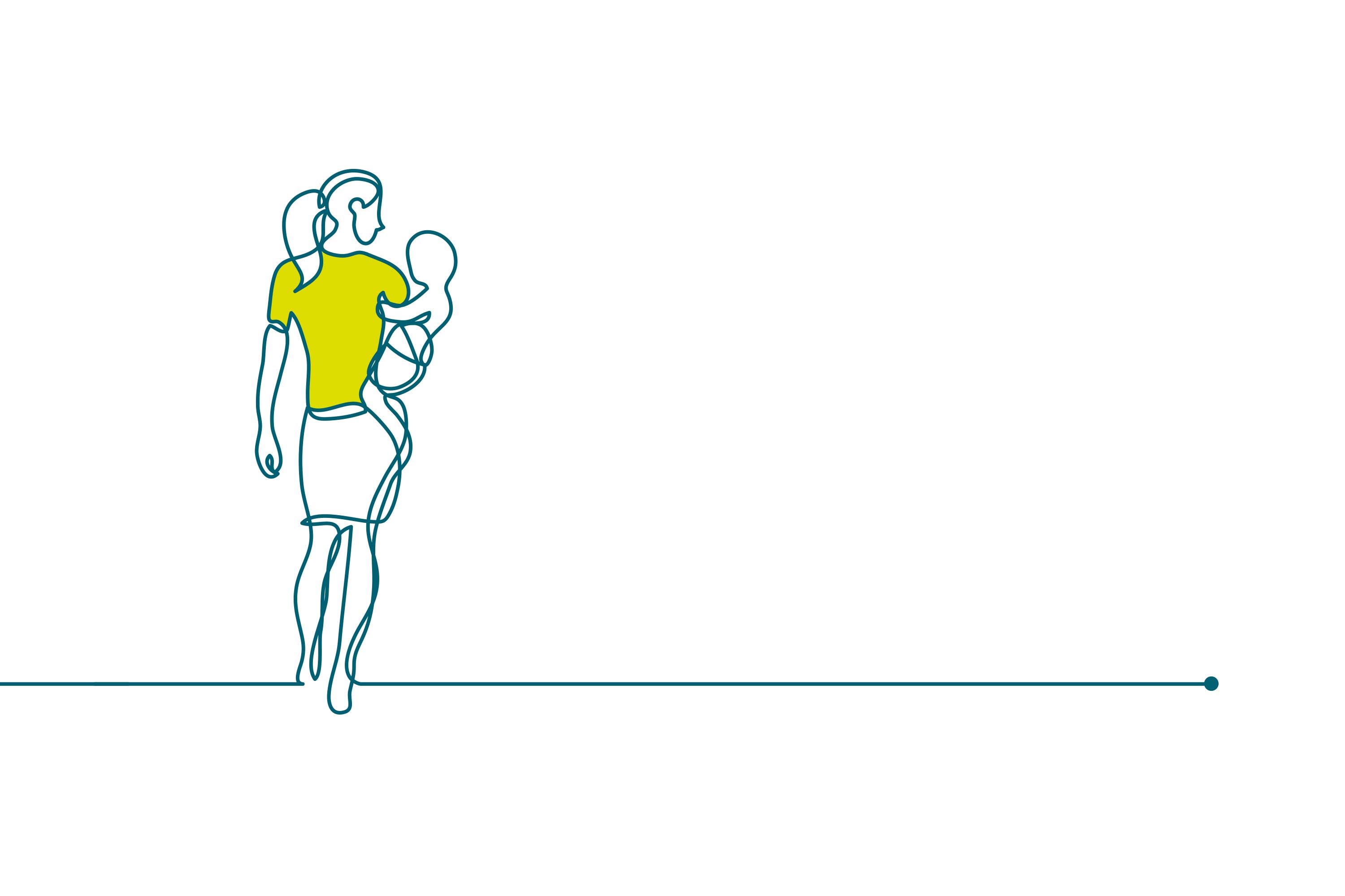
The existing Wills at Work brochure was built around unrealistic stock images that didn’t connect with the end user and did nothing to tell the story of the service. Our initial brief was to make it as representative as possible, but we felt that didn’t give anything for HCR to own – if you changed the logo, it could have been a brochure for any major HR company.
Instead, we developed a series of eye-catching line drawings that reflected both the work life and home life of the end user. While each drawing was created individually, they were all connected throughout the brochure by a continuous line, designed to signify the journey of life. By having non-descript drawings instead of stock images of people, we could appeal to everyone while not focusing on, or leaving out, any one group in society.
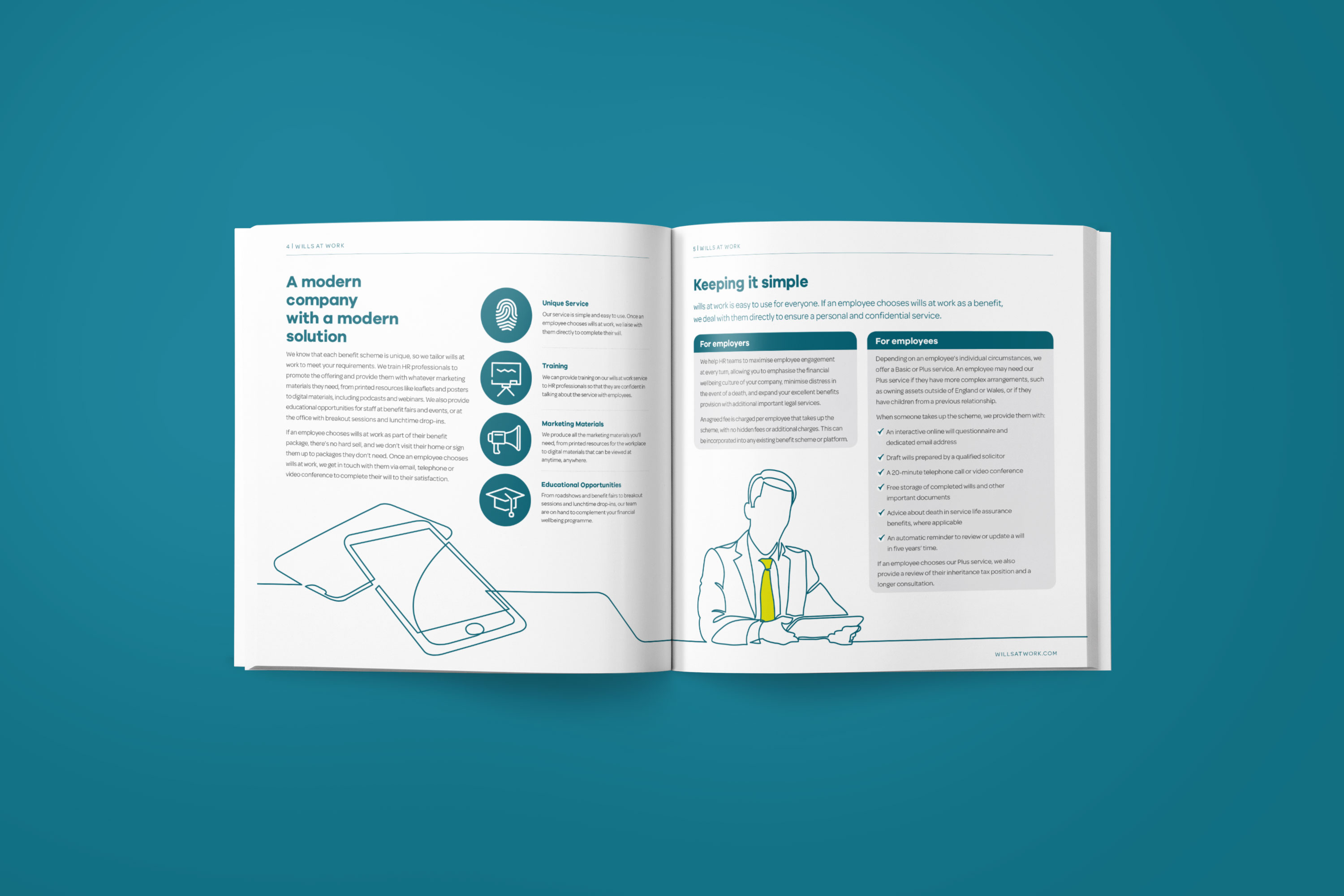


In terms of the copy, we threw away the cold and distant tone of the original process and utilised our new approachable and friendly tone of voice instead, getting the message across clearly and succinctly – our brochure stood at half the page count of the original brochure, with the partner in charge of the service stating that she didn’t know it was possible to say so much in so little words.
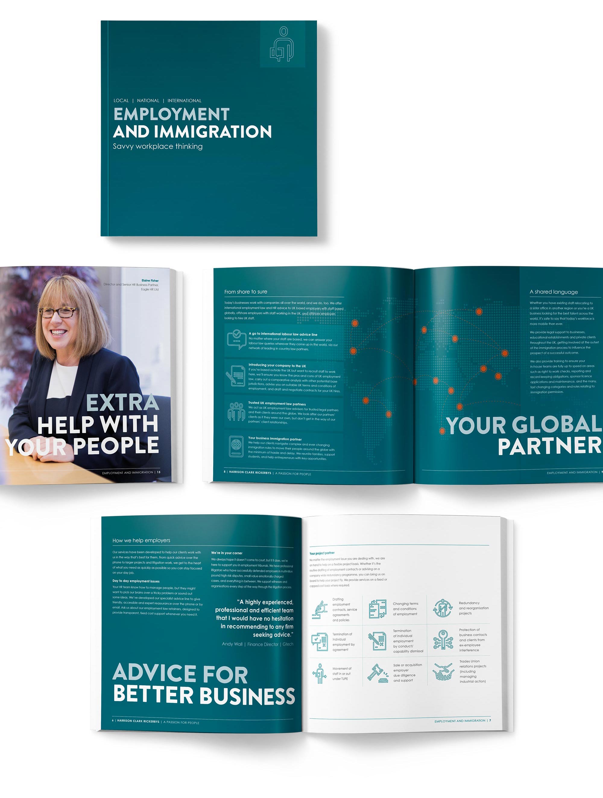
Our approach to this project started a programme for HCR where every service brochure in the business was reviewed and reimagined for greater impact.