
News

James Ashe, Managing Partner
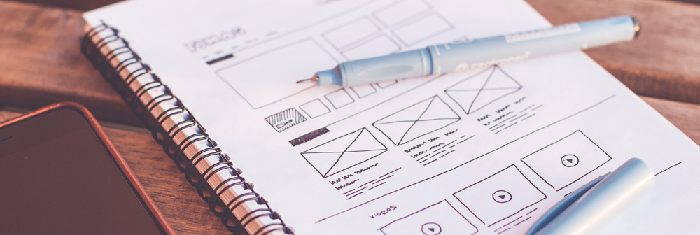
Top Web Design Trends for 2017
Your website’s open for business even when you’re not – it’s your ever-present salesperson and it needs to keep up with the latest digital development. These are the web and UI trends that we think will be the stars of the show in 2017.
Full-screen images and video
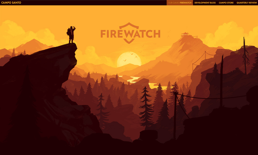
It’s all about the takeover for 2017, and no matter the size of the screen – desktop, mobile or tablet – a full-page image or video is sure to make an impact on your visitors. One large image, graphic or video on your homepage lets you convey your most important message in one quick hit, whether it’s the beauty of your Grade II listed hotel, the excitement of your next event or the necessity of your stunning new product. In particular, video lends a dynamic edge to your page, catching the eye and leaving a lasting impression.
Continuous scrolling and long-form content
If you read a lot of blogs and newspaper websites, you might have noticed that many of them are moving to a continuously scrolling format – when one piece ends, you’re right onto the next with no pause in between.
Removing the interruptions makes online content much more pleasurable to read, but this format also provides the potential for more interactive experiences, even hosting ‘pages within pages’ or providing greater space for images and videos to sit in context. Sounds good to us!
Parallax
We’ve been using parallax design for a while – take a look at The Old Stocks Inn’s site – so we’re pleased to see that the technique is becoming increasingly popular. But what is it? Parallax is a digital effect in which the background moves at a slower rate than the foreground, making scrolling transitions seem much slicker than they would otherwise.
Lots of websites are starting to use it in advertising, allowing the advert to ‘scroll in’, meaning it can’t be skipped as easily. However, we think it can bring a huge amount of depth to a page, and makes the browsing experience feel a lot more interactive.
Micro-interactions
So, what’s a micro-interaction? Here are a couple of examples you’ll likely to see every day! If you open up your Facebook app and hit the ‘like’ button on a post, you’ll see the thumb pop up a little on the screen as the button changes colour. Press and hold, and you’ll be presented with animated reaction buttons that you can use to further illustrate how you feel. In short, they’re simple animations that bring a page to life.
Micro-interactions are great because they help show you three things – what is happening when you hit something, what has just happened, and what will happen next. In a world where we increasingly use our phones to browse, with no cursor present, this kind of visual feedback is really important and will definitely appear more and more throughout 2017.
Minimal navigation

There isn’t a lot of room to play with when considering mobile navigation, so your nav needs to be as simple and clean as possible. In 2017, we’ll be likely to see more menus like Superdry’s with just four or five options main options.
The hamburger icon has become ubiquitous with mobile UI design, but the lonely three line approach to your mobile nav isn’t necessarily that popular on its own – next year, we’re likely to see hamburger icons accompanied by a bit of descriptive text to help put some meat on the bones.
Say it with stats
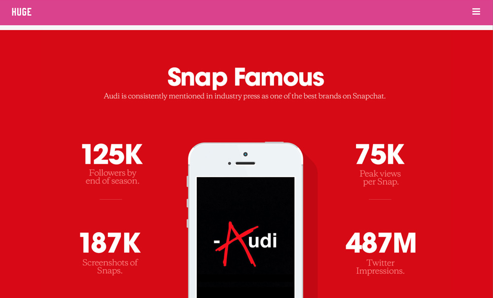
Perhaps this one’s mostly applicable to our little marketing bubble, but we like it – it’s time to get the numbers rolling! Simple stats help to provide your visitors with a sense of certainty and authenticity, even if it’s just the number of cups of coffee drunk in a single day.
We think it’s a great way to illustrate how successful a campaign was, but it can be applied in lots of different ways – for example, an insurance company could demonstrate how much they’ve saved their customers over a year, or a hotel could show how many bookings they’ve had that month.
Looking to implement a few of these features in your next website build?
If you need a new website or are planning to give your existing one a bit of a refresh, why not have a chat with our web design team? Give them a call on 01242 235 000 or click on the button below to drop them an email.
Found this helpful? Sign up for our newsletter!
Our monthly newsletter brings together the best of our blogs, work and news in one handy email. Why not sign up today to find out more about all things social media, PR, design and digital?