Background
After leaving a mid-size accountancy firm and striking out on their own to form a new audit-led firm, Russ Byrd and Vicky Link were looking for a brand that represented their straight-talking nature.
Developing a brand with integrity
We worked closely with Byrd + Link to find out exactly what makes them different to other accountancy businesses in the region. Their brand values were very important to them, dictating the kind of businesses they wanted to work with and the service they provided to their clients. With this in mind, we knew that any brand we developed would have to broadcast the message of trust, loud and clear.
Internationally recognisable
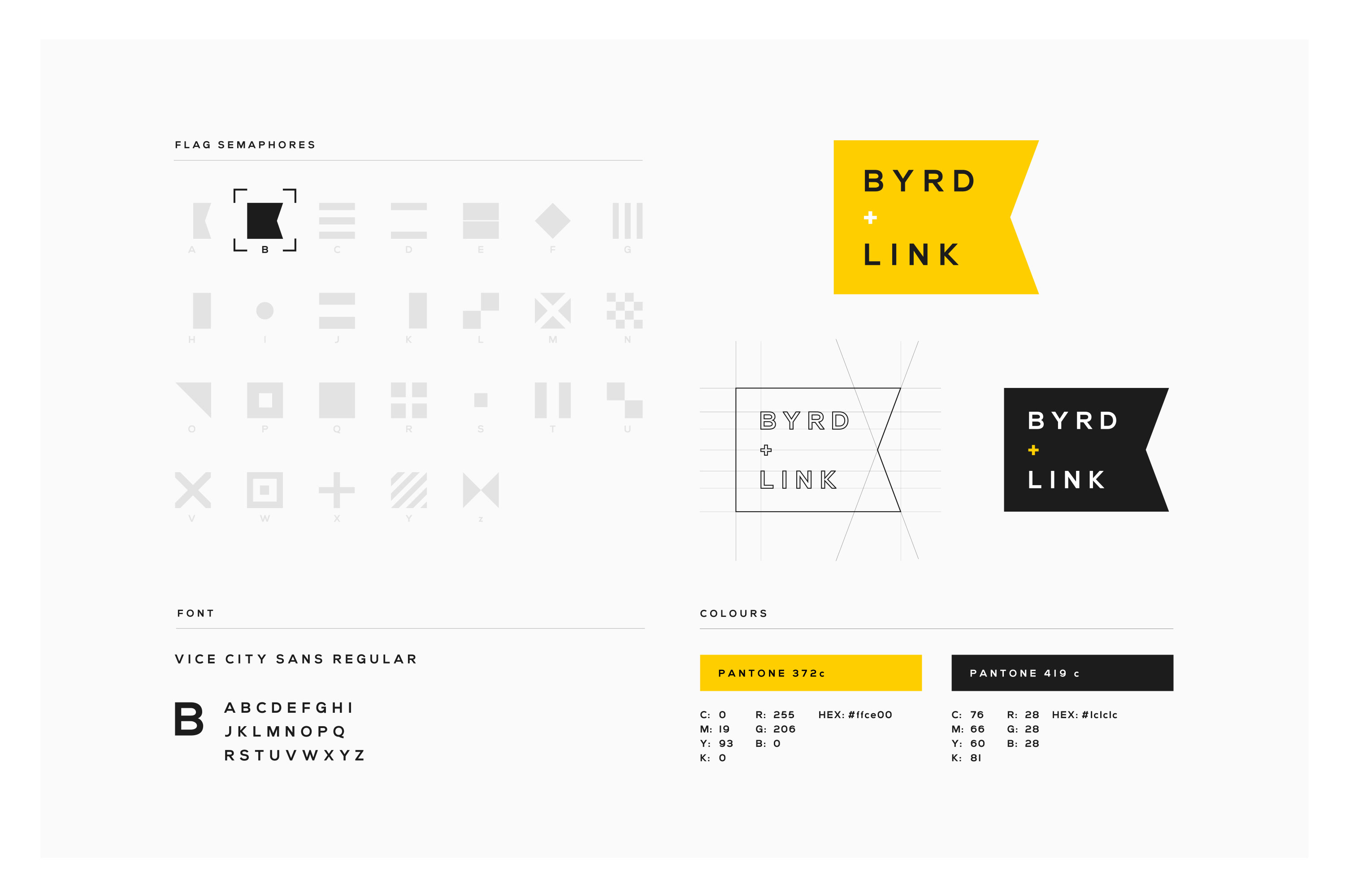
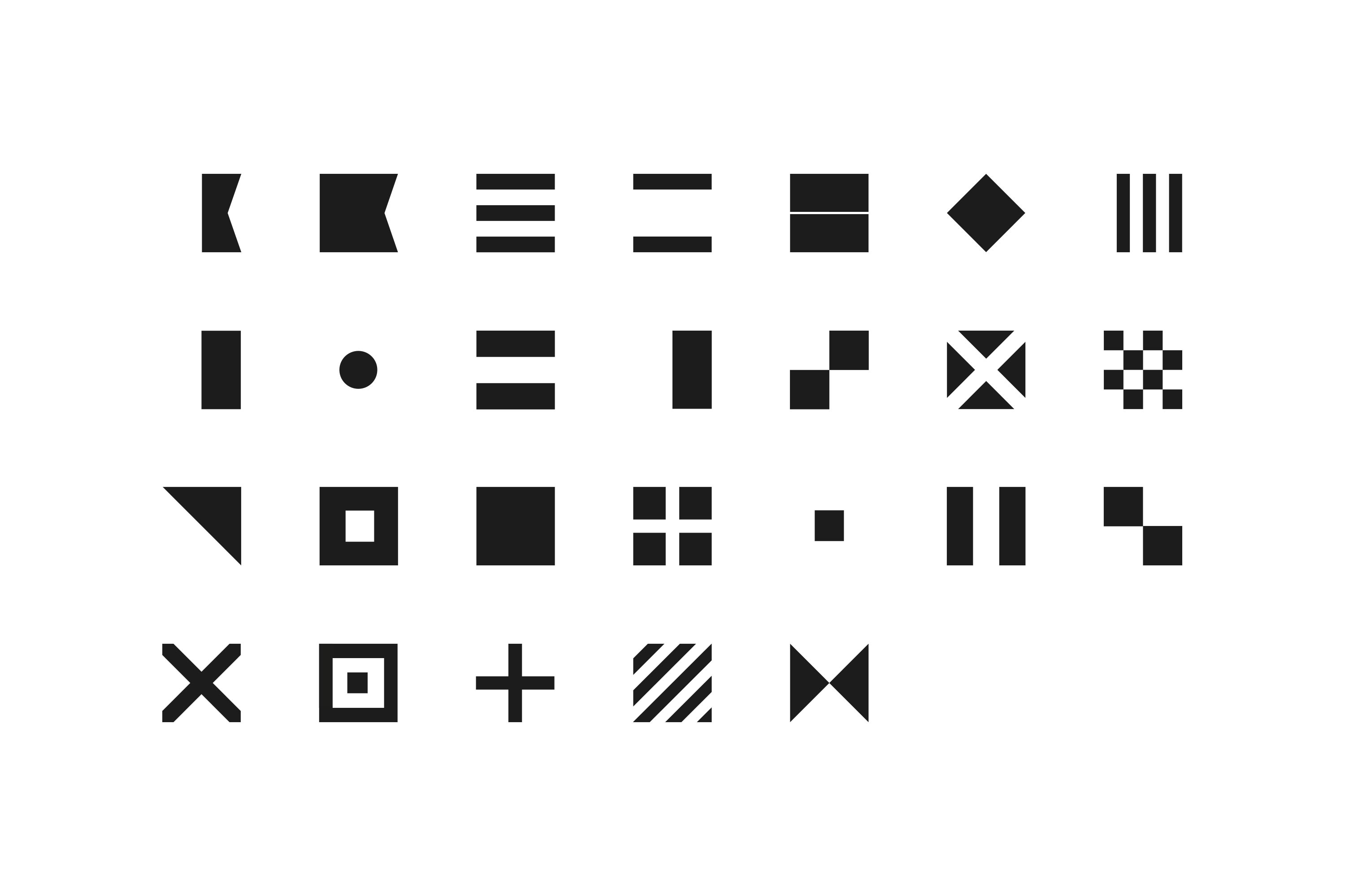
Taking cues from semaphore, the internationally recognised maritime language, we developed a contemporary brand that perfectly suited Byrd + Link’s mission statement to keep their clients abreast of any potential pitfalls or dangers. We chose a bright, bold yellow that would make them stand out amongst a sea of dreary competitor brands.
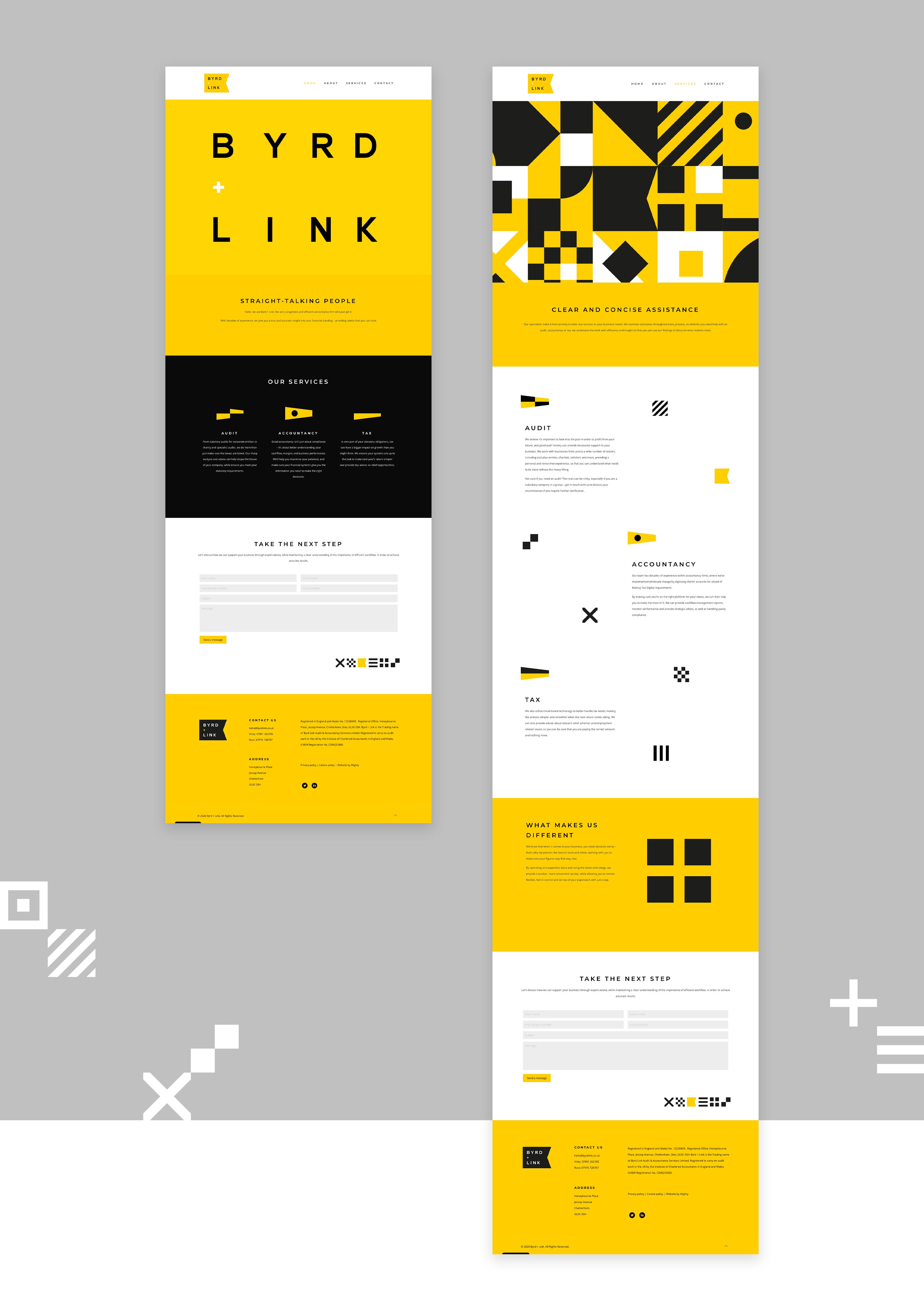
The first port of call
Byrd + Link were looking for a small and simple website that would describe their services in a sharp, focused manner. We copywrote and built a responsive WordPress website with animated headers created in-house, representing the different letters of their brand in the nautical flag alphabet.
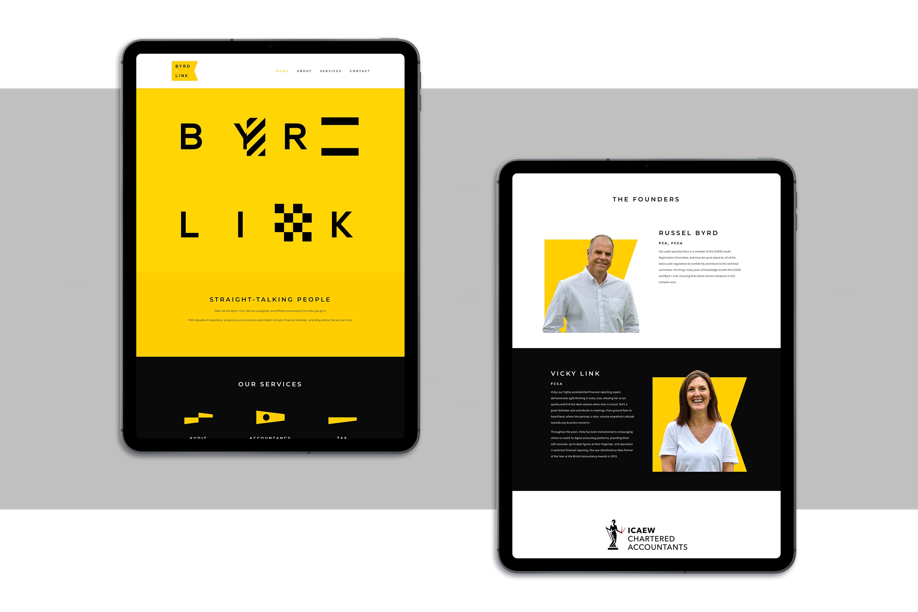
A symbol of trust
We used these symbols to great effect across the website as stunning page furniture to ensure that the website didn’t feel like an off-the-shelf template, as many WordPress websites can. They also allowed us to create unique and quirky corporate wallpapers that could be used across any future collateral.